- Bokeh-使用Bokeh子命令
- Bokeh-使用Bokeh子命令(1)
- Bokeh-扩展Bokeh
- Bokeh-扩展Bokeh(1)
- python bokeh - Python (1)
- Bokeh-服务器(1)
- Bokeh-服务器
- Bokeh教程(1)
- Bokeh教程
- Bokeh-简介
- Bokeh-简介(1)
- Python Bokeh – 颜色类(1)
- Python Bokeh – 颜色类
- Bokeh-熊猫(1)
- Bokeh-熊猫
- python bokeh - Python 代码示例
- 讨论Bokeh
- 讨论Bokeh(1)
- Python Bokeh - 制作饼图
- Python Bokeh - 制作饼图(1)
- Bokeh-导出图(1)
- Bokeh-导出图
- Bokeh-区域图(1)
- Bokeh-区域图
- Bokeh-设置范围(1)
- Bokeh-设置范围
- Bokeh-布局(1)
- Bokeh-布局
- Bokeh-入门(1)
📅 最后修改于: 2020-11-09 05:12:37 🧑 作者: Mango
在本章中,我们将讨论各种类型的轴。
| Sr.No | Axes | Description |
|---|---|---|
| 1 | Categorical Axes | The bokeh plots show numerical data along both x and y axes. In order to use categorical data along either of axes, we need to specify a FactorRange to specify categorical dimensions for one of them. |
| 2 | Log Scale Axes | If there exists a power law relationship between x and y data series, it is desirable to use log scales on both axes. |
| 3 | Twin Axes | It may be needed to show multiple axes representing varying ranges on a single plot figure. The figure object can be so configured by defining extra_x_range and extra_y_range properties |
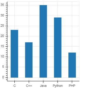
分类轴
在到目前为止的示例中,Bokeh图显示了沿x和y轴的数值数据。为了沿任一轴使用分类数据,我们需要指定一个FactorRange来为其中一个轴指定分类维度。例如,要将给定列表中的字符串用于x轴-
langs = ['C', 'C++', 'Java', 'Python', 'PHP']
fig = figure(x_range = langs, plot_width = 300, plot_height = 300)
例
在以下示例中,显示了一个简单的条形图,显示了所提供的各种课程的注册学生人数。
from bokeh.plotting import figure, output_file, show
langs = ['C', 'C++', 'Java', 'Python', 'PHP']
students = [23,17,35,29,12]
fig = figure(x_range = langs, plot_width = 300, plot_height = 300)
fig.vbar(x = langs, top = students, width = 0.5)
show(fig)
输出
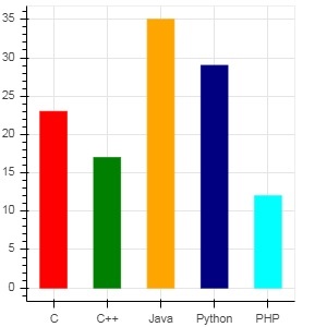
要以不同的颜色显示每个条形,请将vbar()函数的color属性设置为颜色值列表。
cols = ['red','green','orange','navy', 'cyan']
fig.vbar(x = langs, top = students, color = cols,width=0.5)
输出
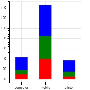
要使用vbar_stack()或hbar_stack()函数呈现垂直(或水平)堆叠的条,请将stackers属性设置为要连续堆叠的字段列表,并将source属性设置为dict对象,该dict对象包含与每个字段对应的值。
在下面的示例中,销售是一个字典,显示三个月内三个产品的销售数字。
from bokeh.plotting import figure, output_file, show
products = ['computer','mobile','printer']
months = ['Jan','Feb','Mar']
sales = {'products':products,
   'Jan':[10,40,5],
   'Feb':[8,45,10],
   'Mar':[25,60,22]}
cols = ['red','green','blue']#,'navy', 'cyan']
fig = figure(x_range = products, plot_width = 300, plot_height = 300)
fig.vbar_stack(months, x = 'products', source = sales, color = cols,width = 0.5)
show(fig)
输出
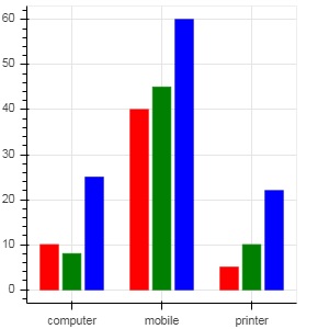
通过在bokeh.transform模块中使用dodge()函数指定条的可视位移,可以获得分组条形图。
dodge()函数为每个条形图引入一个相对偏移,从而获得组的视觉印象。在下面的示例中,特定月份的每组柱状图的vbar()字形都被偏移0.25。
from bokeh.plotting import figure, output_file, show
from bokeh.transform import dodge
products = ['computer','mobile','printer']
months = ['Jan','Feb','Mar']
sales = {'products':products,
   'Jan':[10,40,5],
   'Feb':[8,45,10],
   'Mar':[25,60,22]}
fig = figure(x_range = products, plot_width = 300, plot_height = 300)
fig.vbar(x = dodge('products', -0.25, range = fig.x_range), top = 'Jan',
   width = 0.2,source = sales, color = "red")
fig.vbar(x = dodge('products', 0.0, range = fig.x_range), top = 'Feb',
   width = 0.2, source = sales,color = "green")
fig.vbar(x = dodge('products', 0.25, range = fig.x_range), top = 'Mar',
   width = 0.2,source = sales,color = "blue")
show(fig)
输出
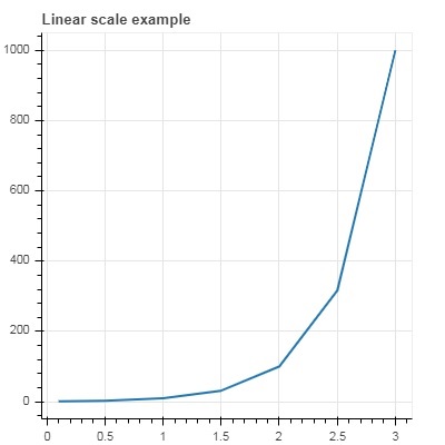
对数刻度轴
当一个图的一个轴上的值随另一个图的轴上的值线性增加而呈指数增长时,通常有必要使前一个轴上的数据以对数刻度显示。例如,如果在x和y数据序列之间存在幂律关系,则希望在两个轴上都使用对数刻度。
Bokeh.plotting API的Figure()函数接受x_axis_type和y_axis_type作为参数,可以通过传递“ log”作为这两个参数的值来指定为对数轴。
第一个图以线性比例显示x和10x之间的曲线。在第二个图中,y_axis_type设置为’log’
from bokeh.plotting import figure, output_file, show
x = [0.1, 0.5, 1.0, 1.5, 2.0, 2.5, 3.0]
y = [10**i for i in x]
fig = figure(title = 'Linear scale example',plot_width = 400, plot_height = 400)
fig.line(x, y, line_width = 2)
show(fig)
输出
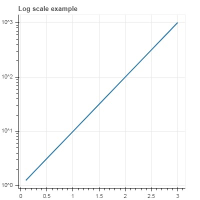
现在更改fig()函数来配置y_axis_type =’log’
fig = figure(title = 'Linear scale example',plot_width = 400, plot_height = 400, y_axis_type = "log")
输出
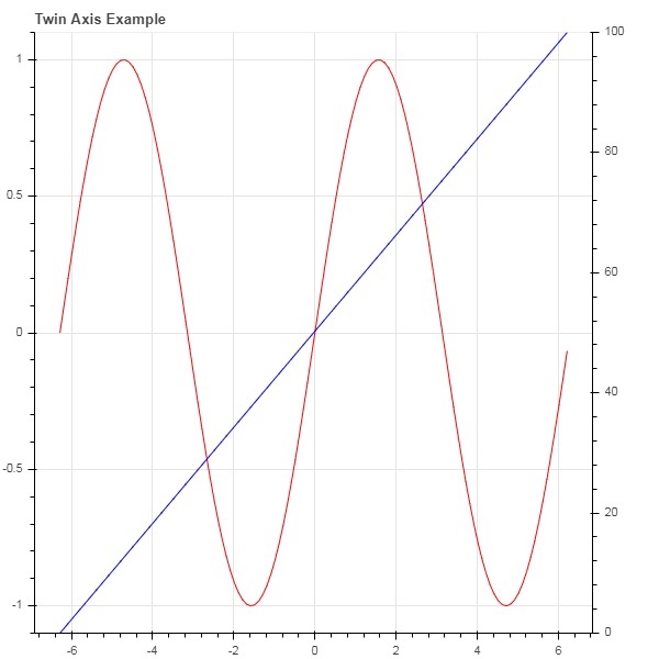
双轴
在某些情况下,可能需要在单个绘图上显示代表不同范围的多个轴。可以通过定义extra_x_range和extra_y_range属性来配置图形对象。在向图中添加新字形时,将使用这些命名范围。
我们尝试在同一图中显示正弦曲线和直线。两个字形的y轴的范围都不同。正弦曲线和直线的x和y数据序列通过以下方式获得-
from numpy import pi, arange, sin, linspace
x = arange(-2*pi, 2*pi, 0.1)
y = sin(x)
y2 = linspace(0, 100, len(y))
在此,x与y之间的曲线表示正弦关系,x与y2之间的曲线为直线。 Figure对象用显式的y_range定义,并添加表示正弦曲线的线字形,如下所示:
fig = figure(title = 'Twin Axis Example', y_range = (-1.1, 1.1))
fig.line(x, y, color = "red")
我们需要一个额外的y范围。它定义为-
fig.extra_y_ranges = {"y2": Range1d(start = 0, end = 100)}
要在右侧添加其他y轴,请使用add_layout()方法。在图中添加代表x和y2的新行字形。
fig.add_layout(LinearAxis(y_range_name = "y2"), 'right')
fig.line(x, y2, color = "blue", y_range_name = "y2")
这将导致具有两个y轴的绘图。完整的代码,输出如下-
from numpy import pi, arange, sin, linspace
x = arange(-2*pi, 2*pi, 0.1)
y = sin(x)
y2 = linspace(0, 100, len(y))
from bokeh.plotting import output_file, figure, show
from bokeh.models import LinearAxis, Range1d
fig = figure(title='Twin Axis Example', y_range = (-1.1, 1.1))
fig.line(x, y, color = "red")
fig.extra_y_ranges = {"y2": Range1d(start = 0, end = 100)}
fig.add_layout(LinearAxis(y_range_name = "y2"), 'right')
fig.line(x, y2, color = "blue", y_range_name = "y2")
show(fig)
输出