将具有 P 值的相关系数添加到 R 中的散点图
在本文中,我们将讨论如何在 R 编程语言中将具有 P 值的相关系数添加到散点图中。
要将具有 P 值的相关系数添加到散点图中,我们使用 R 语言中 ggpubr 包的 stat_cor()函数。 ggpubr 包提供了一些易于使用的函数来创建和自定义 ggplot2 绘图。 stat_cor()函数用于将具有 p 值的相关系数添加到散点图中。 stat_cor()函数将方法作为参数来决定我们需要在散点图上添加哪个相关系数,例如 Pearson、Spearman 或 Kendall 系数。为了调整散点图上标签的位置,我们使用 label.x 和 label.y 参数。
Syntax:
plot + stat_cor( method, label.x, label.y )
Parameters:
- method: determines the method used for correlation coefficient, such as, Pearson, Spearman or Kendall.
- label.x: determines the x-axis position of label.
- label.y: determines the y-axis position of label.
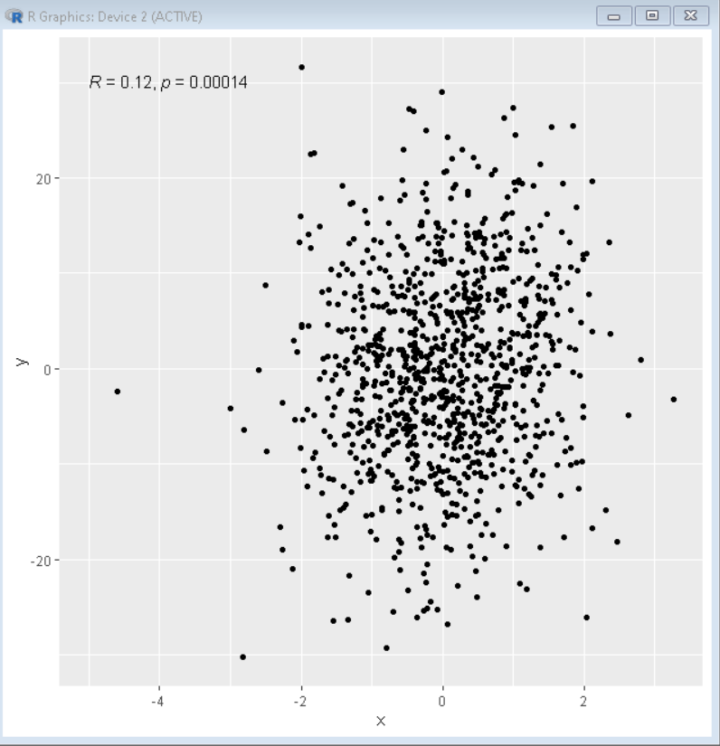
示例 1:皮尔逊相关系数
这里,是一个带有 Pearson 相关系数的散点图。
R
# load library ggplot2
library(ggplot2)
library(ggpubr)

# create sample data
x= rnorm(1000)
y= x+rnorm(1000,0,10)
sample_data<- data.frame(x,y)

# Draw scatter plot with pearson correlation
# coefficient
ggplot( sample_data, aes( x=x, y=y ))+
geom_point()+
stat_cor(method = "pearson", label.x = -5, label.y = 30)
R
# load library ggplot2
library(ggplot2)
library(ggpubr)

# create sample data
x= rnorm(1000)
y= x+rnorm(1000,0,10)
sample_data<- data.frame(x,y)

# Draw scatter plot with spearman correlation
# coefficient
ggplot( sample_data, aes( x=x, y=y ))+
geom_point(pch=10)+
stat_cor(method = "spearman", label.x = -5, label.y = 30)
输出:
示例 2: Spearman 相关系数
这里,是带有 Spearman 相关系数的散点图。
R
# load library ggplot2
library(ggplot2)
library(ggpubr)

# create sample data
x= rnorm(1000)
y= x+rnorm(1000,0,10)
sample_data<- data.frame(x,y)

# Draw scatter plot with spearman correlation
# coefficient
ggplot( sample_data, aes( x=x, y=y ))+
geom_point(pch=10)+
stat_cor(method = "spearman", label.x = -5, label.y = 30)
输出:
