在Python中使用 Matplotlib 的轴类的 Violinplot
Matplotlib是Python中的一个库,它是 NumPy 库的数值数学扩展。
Axes 类包含大部分图形元素:Axis、Tick、Line2D、Text、Polygon 等,并设置坐标系。 Axes 的实例通过回调属性支持回调。
#示例代码
# Implementation of matplotlib function

import matplotlib.pyplot as plt
import numpy as np

# make an agg figure
fig, ax = plt.subplots()
ax.plot([1, 2, 3])
ax.set_title('matplotlib.axes.Axes function')
fig.canvas.draw()
plt.show()
输出: 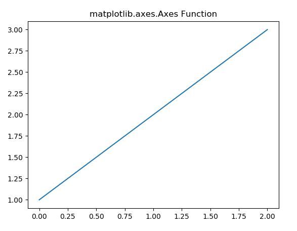
Violinplot 使用 Axes 类
matplotlib 库的 axes 模块中的Axes.violinplot()函数用于为数据集的每一列或序列数据集中的每个向量制作小提琴图。
句法:
Axes.violinplot(self, dataset, positions=None, vert=True, widths=0.5, showmeans=False, showextrema=True, showmedians=False, points=100, bw_method=None, *, data=None)
参数:此方法接受下面描述的以下参数:
- dataset:这个参数是一个数据序列。
- position :此参数用于设置小提琴的位置。
- vert:此参数是可选参数,包含布尔值。如果为真,则绘制垂直小提琴图。否则为水平。
- widths:此参数用于设置每个小提琴的宽度,可以是标量,也可以是序列。
- showmeans :此参数包含布尔值。它用于切换手段的渲染。
- showextrema :此参数包含布尔值。它用于切换极值的渲染。
- showmedians :此参数包含布尔值。它用于切换中值的渲染。
- points :此参数用于定义评估每个高斯核密度估计的点数。
返回:这将返回以下内容:
- result :这将返回将 violinplot 的每个组件映射到 matplotlib.collections 实例列表的字典。
下面的示例说明了 matplotlib.axes 中的 matplotlib.axes.Axes.violinplot()函数:
示例 1:
# Implementation of matplotlib function
import matplotlib.pyplot as plt
import numpy as np

# create test data
np.random.seed(10**7)
data = np.random.normal(0, 5, 100)

fig, ax1 = plt.subplots()
val = ax1.violinplot(data)

ax1.set_title('matplotlib.axes.Axes.violinplot() Example')
plt.show()
输出: 
示例 2:
# Implementation of matplotlib function
import matplotlib.pyplot as plt
import numpy as np

# create test data
np.random.seed(10**7)
data = [sorted(np.random.normal(0, std, 100)) for std in range(1, 5)]

fig, ax1 = plt.subplots()
val = ax1.violinplot(data)
ax1.set_ylabel('Result')
ax1.set_xlabel('Domain Name')
for i in val['bodies']:
    i.set_facecolor('green')
    i.set_alpha(1)

ax1.set_title('matplotlib.axes.Axes.violinplot() Example')
plt.show()
输出: 