使用Python绘制相关矩阵
相关性意味着关联,它是衡量两个变量相关程度的度量。
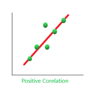
1.正相关:当两个变量一起增加和一起减少时。它们呈正相关。 “1”是完美的正相关。例如 - 需求和利润正相关,对产品的需求越多,利润就越大,因此正相关。
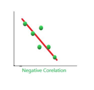
2. 负相关:当一个变量增加而另一个变量一起减少时,反之亦然。它们呈负相关。例如,如果磁铁之间的距离增加,它们的吸引力就会减小,反之亦然。因此,负相关。 '-1' 没有相关性
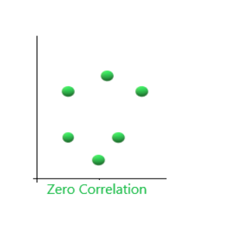
3. 零相关(No Correlation):当两个变量似乎根本没有联系时。 “0”是完美的负相关。例如,你喝的茶量和智力水平。
使用Python绘制相关矩阵
第 1 步:导入库。
Python3
import sklearn
import numpy as np
import matplotlib.pyplot as plt
import pandas as pd
Python3
y = pd.Series([1, 2, 3, 4, 3, 5, 4])
x = pd.Series([1, 2, 3, 4, 5, 6, 7])
correlation = y.corr(x)
correlation
Python3
# plotting the data
plt.scatter(x, y)

# This will fit the best line into the graph
plt.plot(np.unique(x), np.poly1d(np.polyfit(x, y, 1))
         (np.unique(x)), color='red')
Python3
# adds the title
plt.title('Correlation')

# plot the data
plt.scatter(x, y)

# fits the best fitting line to the data
plt.plot(np.unique(x),
         np.poly1d(np.polyfit(x, y, 1))
         (np.unique(x)), color='red')

# Labelling axes
plt.xlabel('x axis')
plt.ylabel('y axis')
Python3
import seaborn as sns

# checking correlation using heatmap
#Loading dataset
flights = sns.load_dataset("flights")

#ploting the heatmap for correlation
ax = sns.heatmap(flights.corr(), annot=True)
第 2 步:找出两个变量之间的相关性。
蟒蛇3
y = pd.Series([1, 2, 3, 4, 3, 5, 4])
x = pd.Series([1, 2, 3, 4, 5, 6, 7])
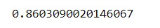
correlation = y.corr(x)
correlation
输出:
第 3 步:绘制图形。这里我们使用散点图。散点图是一种图表,其中数据集中的每个值都由一个点表示。此外,它还显示了两个变量之间的关系。
蟒蛇3
# plotting the data
plt.scatter(x, y)

# This will fit the best line into the graph
plt.plot(np.unique(x), np.poly1d(np.polyfit(x, y, 1))
         (np.unique(x)), color='red')
输出:
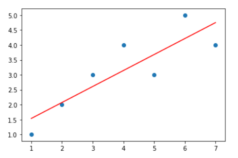
记住上面解释的要点。观察两个图像你会发现相似性另外,观察相关值接近1,因此反映了正相关。
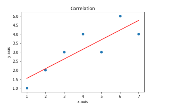
在图表中添加标题和标签
蟒蛇3
# adds the title
plt.title('Correlation')

# plot the data
plt.scatter(x, y)

# fits the best fitting line to the data
plt.plot(np.unique(x),
         np.poly1d(np.polyfit(x, y, 1))
         (np.unique(x)), color='red')

# Labelling axes
plt.xlabel('x axis')
plt.ylabel('y axis')
输出:
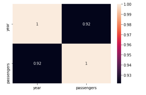
使用热图绘图
有很多方法可以绘制相关矩阵,一种有效的方法是使用热图。使用以下方法很容易理解相关性 热图它告诉一个特征(变量)与所有其他特征(变量)的相关性。换句话说,相关矩阵是一个表格数据,表示给定数据中变量对之间的“相关性”。
蟒蛇3
import seaborn as sns

# checking correlation using heatmap
#Loading dataset
flights = sns.load_dataset("flights")

#ploting the heatmap for correlation
ax = sns.heatmap(flights.corr(), annot=True)
输出: