并排绘制多个ggplot2图
在 R 编程语言中,我们可以通过创建不同的图形或绘制它们来分析数据。有时为了分析,我们需要同时并排查看两个或多个图。在这种情况下,我们使用 R 语言的gridExtra包将框架划分为网格,您可以在这些网格中添加多个图。
gridExtra 包含一个名为arrange() 的函数,用于根据需要排列图。
Syntax:
grid.arrange(plot1, plot2, …, plotn, ncol, nrow)
Parameter:
- plot: some plot
- ncol: number of columns
- nrow: number of rows
首先,首先为所有图创建数据。然后,导入将有助于满足需求的所需包。需要安装并导入到窗口中的一个最重要的包是 gridExtra,因为没有它,图将不会排列在所需的框架中。
现在创建并存储所有创建的数据的图。绘图准备好后,使用带有所需参数的排列()函数排列它们。
示例 1:
R
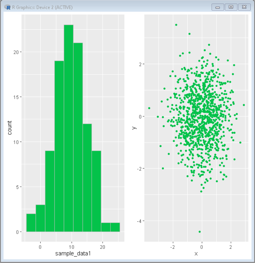
# Create sample data
set.seed(5642)
sample_data1<- round(rnorm(100, 10, 5))
sample_data2 <- data.frame(x = rnorm(1000),
                    y = rnorm(1000))

# Load ggplot2 and gridExtra
library("ggplot2")
library("gridExtra")

# Create both plot and store in variable
plot1<-ggplot(data.frame(sample_data1), aes(sample_data1)) +
geom_histogram(bins = 10, fill="#04c24a", color="gray")

plot2<- ggplot(sample_data2, aes(x = x, y = y)) + geom_point(color="#04c24a")

# Divide frame in grid using grid.arrange function
# and put above created plot int it
grid.arrange(plot1, plot2, ncol = 2)
R
# Create sample data
set.seed(5642)
sample_data1 <- data.frame(name=c("Geek1","Geek2","Geek3",
                                  "Geek4","Geeek5") ,
                           value=c(31,12,15,28,45))

sample_data2 <- data.frame(x = rnorm(400))
sample_data3 <- data.frame(name=c("C++","C#","Java","R","Pyhton") ,
                           value=c(301,112,115,228,145))

# Load ggplot2 and gridExtra
library("ggplot2")
library("gridExtra")

# Create both plot and store in variable
plot1<-ggplot(sample_data1, aes(x=name, y=value))+
geom_segment( aes(x=name, xend=name, y=0, yend=value), color="grey") +
geom_point( color="green", size=4)

plot2<-ggplot(sample_data2, aes(x = x)) +
geom_density(fill="#69b3a2", color="#e9ecef", alpha=0.8)

plot3<-ggplot(sample_data3, aes(x=name, y=value)) +
geom_bar(fill="#69b3a2", stat = "identity")

# Divide frame in grid using grid.arrange function
# and put above created plot int it
grid.arrange(plot1, plot2,plot3, ncol= 3)
输出:
示例 2:
电阻
# Create sample data
set.seed(5642)
sample_data1 <- data.frame(name=c("Geek1","Geek2","Geek3",
                                  "Geek4","Geeek5") ,
                           value=c(31,12,15,28,45))

sample_data2 <- data.frame(x = rnorm(400))
sample_data3 <- data.frame(name=c("C++","C#","Java","R","Pyhton") ,
                           value=c(301,112,115,228,145))

# Load ggplot2 and gridExtra
library("ggplot2")
library("gridExtra")

# Create both plot and store in variable
plot1<-ggplot(sample_data1, aes(x=name, y=value))+
geom_segment( aes(x=name, xend=name, y=0, yend=value), color="grey") +
geom_point( color="green", size=4)

plot2<-ggplot(sample_data2, aes(x = x)) +
geom_density(fill="#69b3a2", color="#e9ecef", alpha=0.8)

plot3<-ggplot(sample_data3, aes(x=name, y=value)) +
geom_bar(fill="#69b3a2", stat = "identity")

# Divide frame in grid using grid.arrange function
# and put above created plot int it
grid.arrange(plot1, plot2,plot3, ncol= 3)
输出:
