Python Bokeh - 制作饼图
Bokeh 是一个Python交互式数据可视化。它使用 HTML 和 JavaScript 渲染其绘图。它针对现代 Web 浏览器进行演示,提供具有高性能交互性的新颖图形的优雅、简洁构造。
让我们看看如何在 Bokeh 中绘制饼图。没有为我们提供直接绘制饼图的模块,但我们可以使用楔形字形制作饼图。可以使用bokeh.plotting.figure.wedge()函数绘制楔形。
在wedge()函数中,主要参数是楔形的x和y坐标、 radius 、 start_angle和end_angle 。为了以看起来像饼图的方式绘制楔形,所有楔形的x 、 y和radius参数将相同。我们只会调整start_angle和end_angle 。
示例 1:
# importing the modules
from bokeh.plotting import figure, output_file, show

# file to save the model
output_file("gfg.html")

# instantiating the figure object
graph = figure(title = "Bokeh Pie Chart")

# center of the pie chart
x = 0
y = 0

# radius of the glyphs
radius = 1

# starting angle values
start_angle = [0, 1.8, 2.5,
               3.7, 5.6]

# ending angle values
end_angle = [1.8, 2.5, 3.7,
             5.6, 0]

# color of the wedges
color = ["violet", "blue", "green",
          "yellow", "red"]

# plotting the graph
graph.wedge(x, y, radius,
            start_angle,
            end_angle,
            color = color)

# displaying the graph
show(graph)
输出 : 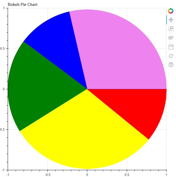
示例 2:在他的示例中,我们将可视化一些数据。在数据中,我们提供了 2017-18 年印度在 GVA 中的行业份额。股份是:
Agriculture - 17.1%
Industry - 29.1%
Services - 53.8%
要找到start_angle和end_angle ,我们需要使用以下公式将百分比转换为弧度:
math.radians((percent / 100) * 360)# importing the modules
from bokeh.plotting import figure, output_file, show
import math
# file to save the model
output_file("gfg.html")
# instantiating the figure object
graph = figure(title = "Bokeh Pie Chart")
# name of the sectors
sectors = ["Agriculture", "Industry", "Services"]
# % tage weightage of the sectors
percentages = [17.1, 29.1, 53.8]
# converting into radians
radians = [math.radians((percent / 100) * 360) for percent in percentages]
# starting angle values
start_angle = [math.radians(0)]
prev = start_angle[0]
for i in radians[:-1]:
start_angle.append(i + prev)
prev = i + prev
# ending angle values
end_angle = start_angle[1:] + [math.radians(0)]
# center of the pie chart
x = 0
y = 0
# radius of the glyphs
radius = 1
# color of the wedges
color = ["yellow", "red", "lightblue"]
# plotting the graph
for i in range(len(sectors)):
graph.wedge(x, y, radius,
start_angle = start_angle[i],
end_angle = end_angle[i],
color = color[i],
legend_label = sectors[i])
# displaying the graph
show(graph)
输出 : 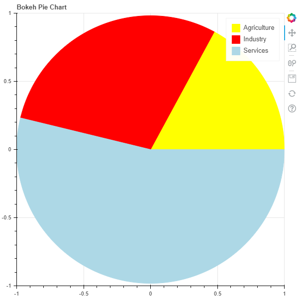
在评论中写代码?请使用 ide.geeksforgeeks.org,生成链接并在此处分享链接。