将应用程序拆分为小部件是指将大型小部件分解为更小、更易于管理的小部件,这些小部件可以推断为更小的代码块。这里的主要事情是了解何时将小部件拆分为较小的小部件。我们将讨论何时拆分小部件以及如何执行此操作的方法。
何时拆分小部件:
- 大小部件:每当我们有一个大部件时,它里面有许多嵌套的小部件和其他较小的小部件。建议将大部件拆分为易于管理的较小部件。
- 重复小部件:有时我们会创建一些我们可能在很多地方使用的自定义小部件(例如自定义 Button ),然后将代码片段拆分为单独的小部件也是一个很好的做法。这有助于我们清理额外的代码行并在一个地方管理对小部件的更改。
- 复杂的小部件:有些情况下小部件可能不会太大,但由于实现它变得复杂,因此为了更好地理解,我们可能会将代码拆分为不同的小部件。
拆分应用程序:
1. 使用Flutter大纲:
使用Flutter Outline 工具将应用拆分为小部件,如下所示:
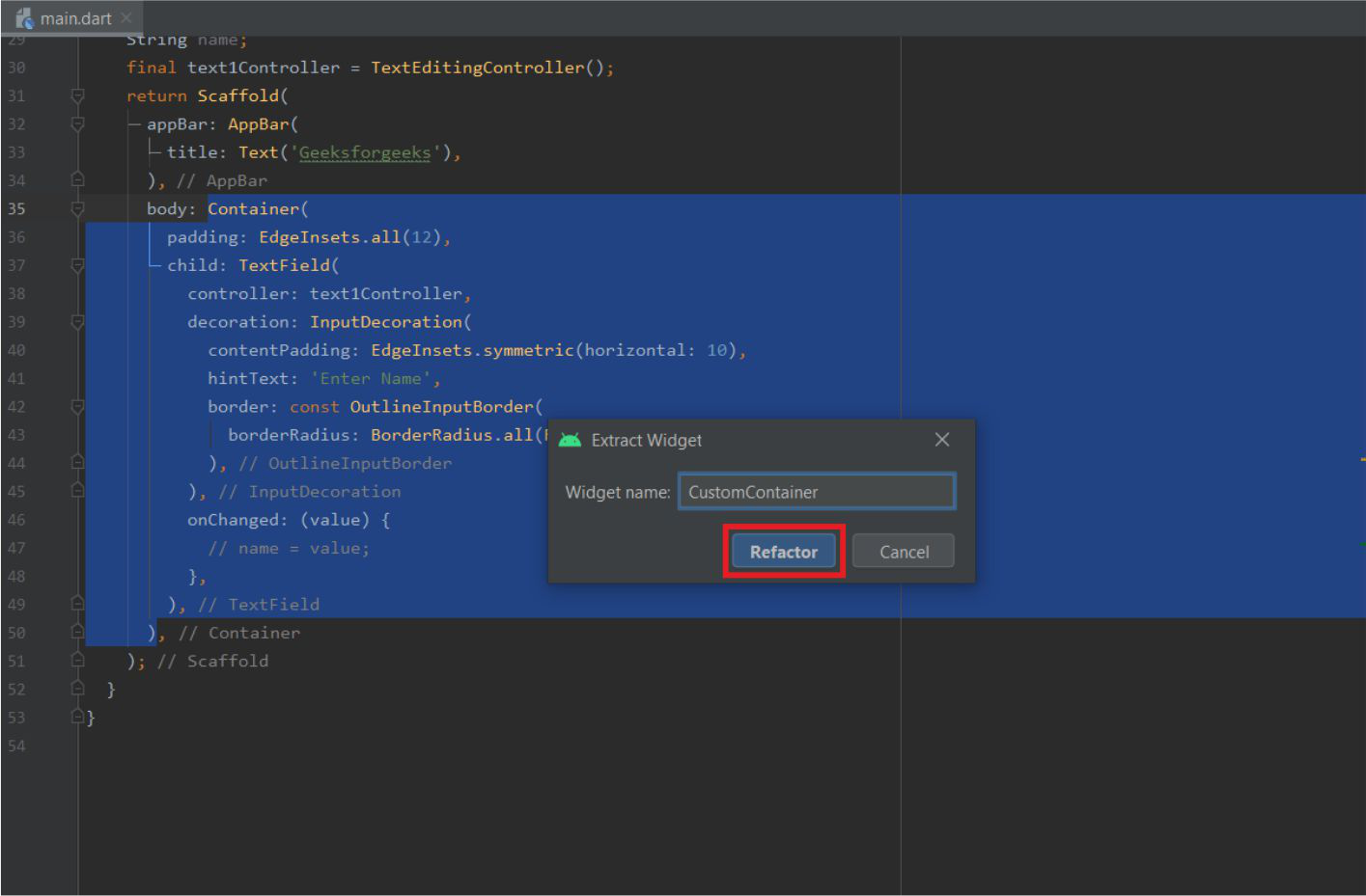
- Flutter Outline 作为隐藏选项卡出现在右侧。打开选项卡后,我们可以看到当前dart文件的 Widget Tree。右键单击我们要提取的小部件 -> 单击提取小部件。
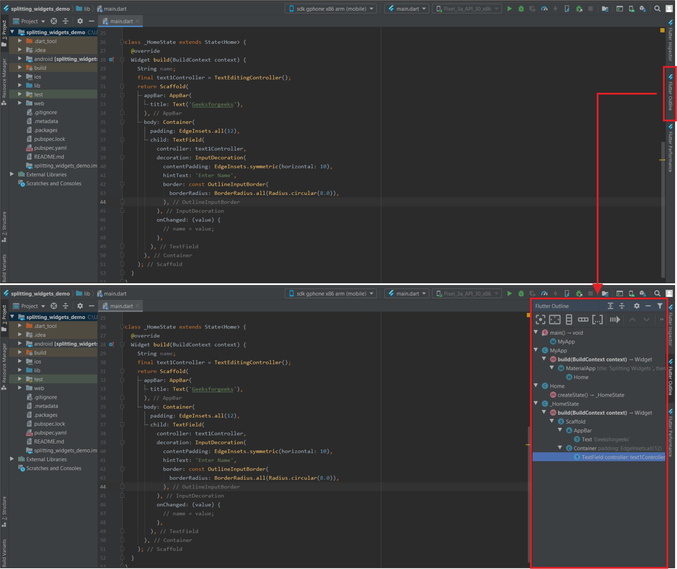
Flutter大纲和小部件树
- 为小部件命名 -> 单击重构。小部件将被提取。我们也可以将小部件放在另一个文件中(如果我们将它保存在新文件中,我们必须导入它)。
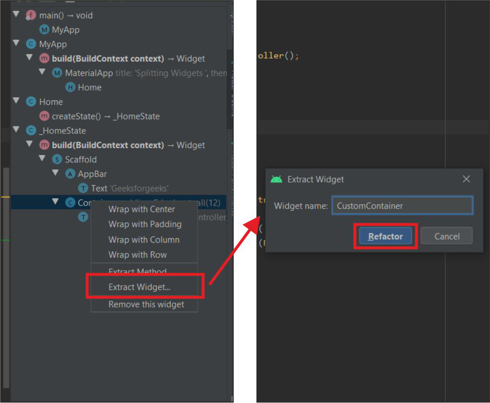
提取和重构
这将从应用程序中提取小部件,如下所示:
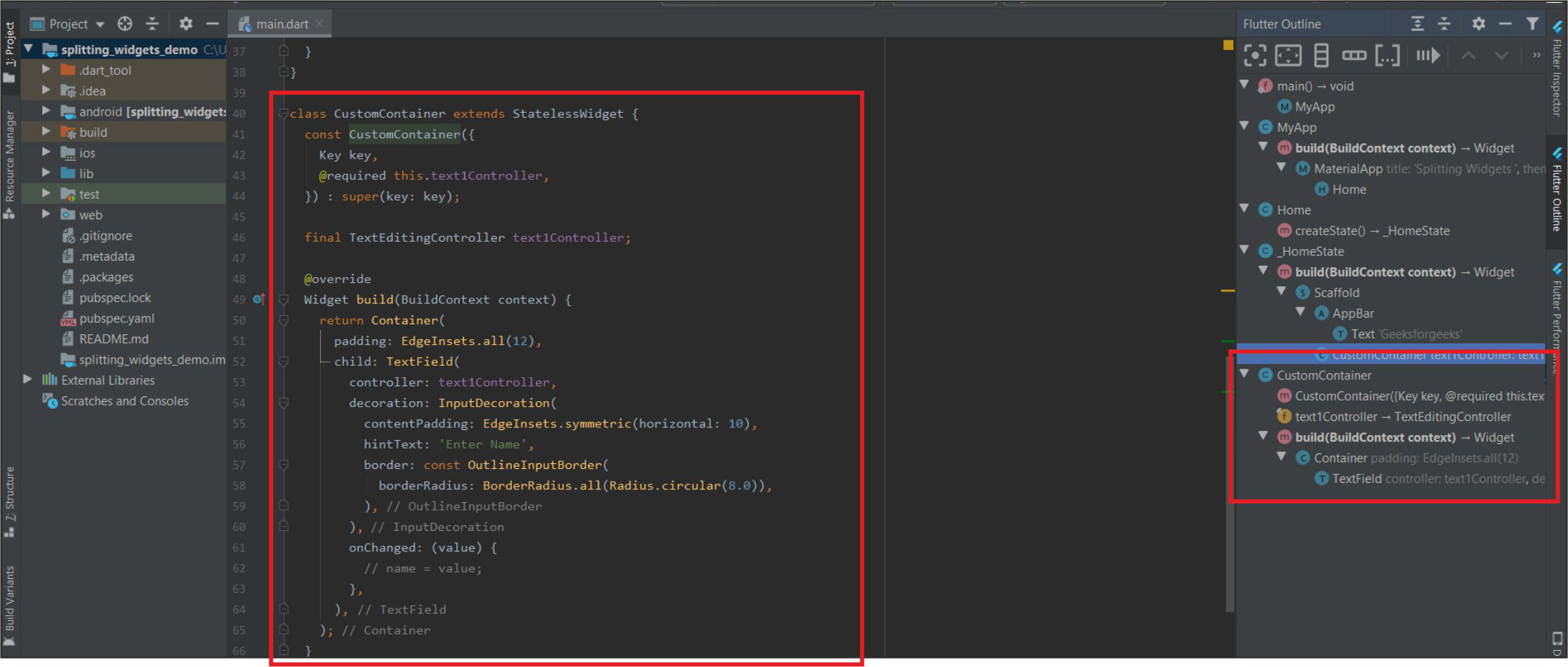
提取的小部件
2.通过右键单击小部件:
按照以下快捷方式快速重构应用程序中的小部件。
- 通过右键单击特定小部件 ->重构->提取Flutter Widge t(我们也可以使用快捷键Ctrl+Alt+W )
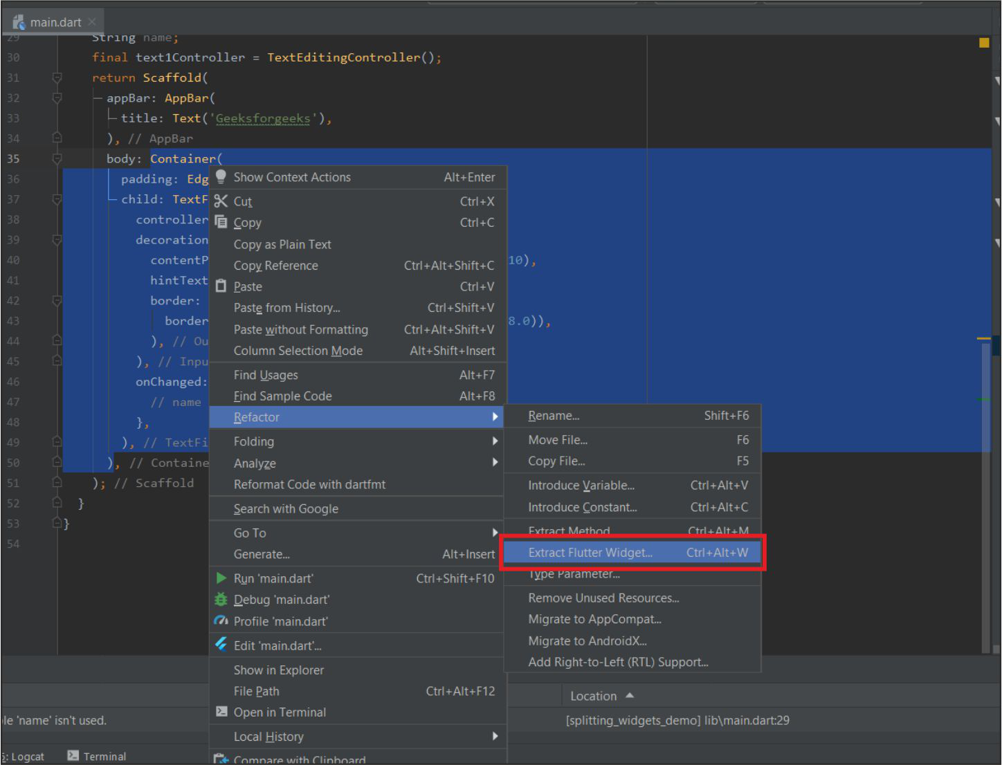
单击提取Flutter小部件..
- 给它一个名字,然后点击重构。
命名并单击重构
例子 :
下面是一个基本计算器应用程序的示例,该应用程序将两个数字作为用户的输入,并在用户单击任何加法、减法等按钮时产生输出。只有一个dart文件,即dart文件。在这个例子中dart。
Dart
import 'package:flutter/cupertino.dart';
import 'package:flutter/material.dart';

void main() {
  runApp(MyApp());
}

class MyApp extends StatelessWidget {
  @override
  Widget build(BuildContext context) {
    return MaterialApp(
      debugShowCheckedModeBanner: false,
      title: 'GeeksforGeeks',
      theme: ThemeData(
        primarySwatch: Colors.green,
      ),
      home: Home(),
    );
  }
}

class Home extends StatefulWidget {
  @override
  _HomeState createState() => _HomeState();
}

class _HomeState extends State {
  double n1, n2, op = 0; // 1st Number, 2nd Number and Output.
  @override
  Widget build(BuildContext context) {
    return Scaffold(
      appBar: AppBar(
        title: Text('GeeksforGeeks'),
      ),
      body: Container(
        padding: EdgeInsets.all(18),
        child: Column(
          children: [
            Text(
              'Simple Calculator',
              style: TextStyle(fontSize: 24),
            ),
            SizedBox(
              height: 15,
            ),
            Row(
              children: [
                CustomTextField(
                    hint: '1st Number',
                    onChanged: (s) {
                      n1 = double.parse(s);
                      print(n1);
                    }),
                SizedBox(width: 10),
                CustomTextField(
                    hint: '2nd Number',
                    onChanged: (s) {
                      n2 = double.parse(s);
                      print(n2);
                    })
              ],
            ),
            SizedBox(height: 10),
            Row(
              mainAxisAlignment: MainAxisAlignment.spaceEvenly,
              children: [
                CustomButton(
                    symbol: '+',
                    onTap: () {
                      setState(() {
                        op = (n1 + n2);
                      });
                    }),
                CustomButton(
                    symbol: '-',
                    onTap: () {
                      setState(() {
                        op = (n1 - n2);
                      });
                    }),
                CustomButton(
                    symbol: '×',
                    onTap: () {
                      setState(() {
                        op = (n1 * n2);
                      });
                    }),
                CustomButton(
                    symbol: '÷',
                    onTap: () {
                      setState(() {
                        if (n2 == 0)
                          op = -1;
                        else
                          op = (n1 / n2).toDouble();
                      });
                    }),
              ],
            ),
            SizedBox(height: 10),
            Text(
              'Output',
              style: TextStyle(fontSize: 18),
            ),
            SizedBox(height: 5),
            Container(
              padding: EdgeInsets.all(10),
              width: double.infinity,
              height: 50,
              decoration: BoxDecoration(
                  color: Colors.black12,
                  borderRadius: BorderRadius.circular(18)),
              child: Center(
                child: Text(
                  op.toStringAsFixed(2),
                  style: TextStyle(fontSize: 24),
                ),
              ),
            )
          ],
        ),
      ),
    );
  }
}
Dart
// This is a Custom TextField Widget
class CustomTextField extends StatelessWidget {

  // In the Constructor onChanged and hint fields are added.
  const CustomTextField({Key key, this.onChanged, this.hint}) : super(key: key);

  // It requires the onChanged Function
  // and the hint to be Shown
  final Function onChanged;
  final String hint;

  @override
  Widget build(BuildContext context) {
    return Expanded(
      child: TextField(

        // onChanged Function is used here.
        onChanged: onChanged,
        style: TextStyle(fontSize: 18),
        decoration: InputDecoration(
            contentPadding: EdgeInsets.symmetric(horizontal: 20),
            filled: true,
            fillColor: Colors.black12,
            border: OutlineInputBorder(
                borderSide: BorderSide.none,
                borderRadius: BorderRadius.circular(18)),

            // hint String is used here.
            hintText: hint,
            helperText: 'Keep it Short'),
      ),
    );
  }
}
Dart
//This is a Custom Button Widget.
class CustomButton extends StatelessWidget {

  // In the Constructor onTap and Symbol fields are added.
  const CustomButton({Key key, this.onTap, this.symbol}) : super(key: key);

  // It Requires 2 fields Symbol(to be displayed)
  // and onTap Function
  final String symbol;
  final Function onTap;

  @override
  Widget build(BuildContext context) {
    return GestureDetector(

      // The onTap Field is used here.
      onTap: onTap,
      child: Container(
        height: 60,
        width: 60,
        decoration: BoxDecoration(
          shape: BoxShape.circle,
          color: Colors.blueGrey,
        ),
        child: Center(
          child: Text(

            // The Symbol is used here
            symbol,
            style: TextStyle(
              fontSize: 35,
              fontWeight: FontWeight.bold,
              color: Colors.white,
            ),
          ),
        ),
      ),
    );
  }
}以上几行显示了应用程序的主屏幕。它包括几个内置小部件和几个自定义小部件(由内置小部件制成)。这些小部件位于“主页”小部件下方。
第一个自定义小部件是使用上述方法提取的自定义文本字段,并在构造函数中添加了一些字段,以便更好地使用和减少代码。
Dart
// This is a Custom TextField Widget
class CustomTextField extends StatelessWidget {

  // In the Constructor onChanged and hint fields are added.
  const CustomTextField({Key key, this.onChanged, this.hint}) : super(key: key);

  // It requires the onChanged Function
  // and the hint to be Shown
  final Function onChanged;
  final String hint;

  @override
  Widget build(BuildContext context) {
    return Expanded(
      child: TextField(

        // onChanged Function is used here.
        onChanged: onChanged,
        style: TextStyle(fontSize: 18),
        decoration: InputDecoration(
            contentPadding: EdgeInsets.symmetric(horizontal: 20),
            filled: true,
            fillColor: Colors.black12,
            border: OutlineInputBorder(
                borderSide: BorderSide.none,
                borderRadius: BorderRadius.circular(18)),

            // hint String is used here.
            hintText: hint,
            helperText: 'Keep it Short'),
      ),
    );
  }
}
此处使用的第二个自定义小部件是使用手势检测器制作的自定义按钮。
Dart
//This is a Custom Button Widget.
class CustomButton extends StatelessWidget {

  // In the Constructor onTap and Symbol fields are added.
  const CustomButton({Key key, this.onTap, this.symbol}) : super(key: key);

  // It Requires 2 fields Symbol(to be displayed)
  // and onTap Function
  final String symbol;
  final Function onTap;

  @override
  Widget build(BuildContext context) {
    return GestureDetector(

      // The onTap Field is used here.
      onTap: onTap,
      child: Container(
        height: 60,
        width: 60,
        decoration: BoxDecoration(
          shape: BoxShape.circle,
          color: Colors.blueGrey,
        ),
        child: Center(
          child: Text(

            // The Symbol is used here
            symbol,
            style: TextStyle(
              fontSize: 35,
              fontWeight: FontWeight.bold,
              color: Colors.white,
            ),
          ),
        ),
      ),
    );
  }
}
输出:
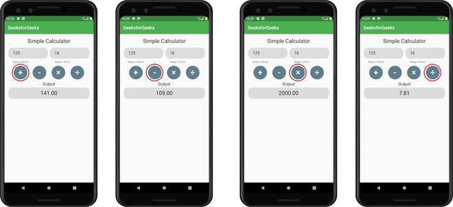
通过点击不同的按钮获得的结果。
想要一个更快节奏和更具竞争力的环境来学习 Android 的基础知识吗?
单击此处前往由我们的专家精心策划的指南,旨在让您立即做好行业准备!