散景中的标签
在本文中,我们将学习散景中的标签。标签是用于定义情节中某些内容的简短单词或短语。
让我们举一个例子,我们在图中绘制一组点。现在,如果我们正在处理现实生活中的统计数据,那么要绘制图中的点,我们需要用适当的信息标记 X 轴和 Y 轴,以便定义我们正在绘制的相互对照的内容。这就是这个词出现的地方。它们帮助我们确定我们在 X 轴和 Y 轴上绘制的究竟是什么。除此之外,标签在图中还具有各种其他功能。
所以,让我们用一组简单的点在 X 轴和 Y 轴上做一个简单的实现。可以使用Google Colab或任何其他文本编辑器来实现上述概念。但是如果我们使用的是本地设备,请确保之前已经安装了Python 。之后,我们需要安装bokeh 。打开命令提示符并编写以下代码进行安装:
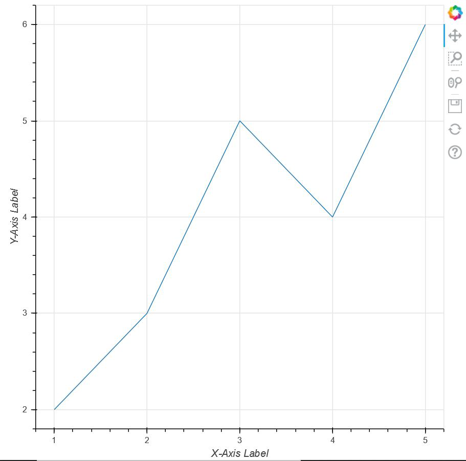
pip install bokeh 现在,让我们举一个简单的例子来了解散景中的标签。在这里,我们将获取一组点,并将它们相互绘制,其中 X 轴和 Y 轴具有使用散景编码的标签。
示例代码:
Python3
# importing show from bokeh.io
# module to show the plot
from bokeh.io import show

# importing figure from
# bokeh.plotting to create an
# empty plot
from bokeh.plotting import figure


# Creating a set of points using
# two arrays x and y
x = [1, 2, 3, 4, 5]
y = [2, 3, 5, 4, 6]

# Creating an empty figure with plot width
# and height as 600
p = figure(plot_width=600, plot_height=600)

# defining that the points should be joined
# with a line
p.line(x, y)

# Defining the X-Axis Label
p.xaxis.axis_label = "X-Axis Label"

# defining the Y-Axis Label
p.yaxis.axis_label = "Y-Axis Label"

# showing the above plot
show(p)
Python3
# importing show from bokeh.io
# module to show the plot
# importing show from bokeh.io
from bokeh.io import show

# importing label from
# bokeh.models.annotations module
from bokeh.models.annotations import Label

# importing figure from bokeh.plotting
# module
from bokeh.plotting import figure


# Creating an empty figure with plot
# width and size to be 600 and 500
# respectively
p = figure(plot_width=600, plot_height=500)

# Plotting the points in the shape of
# a circle with color green and size 10
p.circle([2, 5, 8], [4, 7, 6], color="green", size=10)

# Labelling the X-Axis
p.xaxis.axis_label = "X-Axis-Label"

# Labelling the Y-Axis
p.yaxis.axis_label = "Y-Axis_Label"

# Creating a label for the point (5,7)
# where the text for the point will be
# "Second Point" alng with defining
# the position of the text
label = Label(x=5, y=7, x_offset=10, y_offset=-30, text="Second Point")

# Implementing label in our plot
p.add_layout(label)

# Showing the above plot
show(p)
Python3
# importing figure from
# Bokeh.plotting
from bokeh.plotting import figure

# importing ColumnDataSource and LabelSet
# from bokeh.models
from bokeh.models import ColumnDataSource, LabelSet

# import show from broken.io module
from bokeh.io import show


# Using ColumnDataSource we are providing
# Column names to a sequence of values
source = ColumnDataSource(data=dict(
    marks=[166, 171, 172, 168, 174, 162],
    roll_no=[0, 1, 2, 3, 4, 5],
    names=['Joey', 'Chandler', 'Monica',
           'Phoebe', 'Rachel', 'Ross']))

# Creating an empty figure
p = figure(plot_width=750, plot_height=600)

# Plotting the data in the form of triangle
p.triangle(x='roll_no', y='marks', size=8, source=source)

# Labelling the X-Axis
p.xaxis.axis_label = 'Roll_Numbers'

# Labelling the Y-Axis
p.yaxis.axis_label = 'Marks'

# Using LabelSet, we are labelling each of the
# points with names created in source
labels = LabelSet(x='roll_no', y='marks', text='names',
                  x_offset=5, y_offset=5, source=source)

Adding that label to our figure
p.add_layout(labels)

# Showing the above plot
show(p)
Python3
# import numpy package
import numpy as np

# importing figure and show from
# bokeh.plotting
from bokeh.plotting import figure, show


# Creating an array of 100 numbers
# between 0 to 1 using linespace
x = np.linspace(0, 1, 100)

# Creating an array of sin
# values of x in y
y = np.sin(x)

# Creating an empty figure
p = figure(plot_width=500, plot_height=500)

# Creating the first plot with color as red and label as
# sin(x)
p.circle(x, y, legend_label="1st Plot", color="red")

# Drawing a line through all the points with the
# same color
p.line(x, y, legend_label="1st Plot", line_color="red")

# Drawing the second plot as yellow and labelling as
# the 2nd plot
p.circle(x, y**3, legend_label="2nd Plot", color="yellow")

# Drawing a line through all the points of the
# second plot
p.line(x, y**3, legend_label="2nd Plot", line_color="yellow", line_width=2)

# showing the above plot
show(p)
输出:
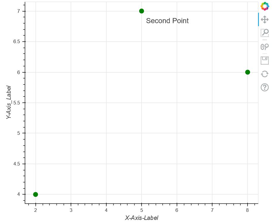
现在,让我们深入探讨这个话题。除了在上述方法中仅在轴上添加标签外, bokeh.models.annotations 还为我们提供了一个名为Labels的包。标签具有我们将在下面探索的各种功能:
在下面的代码中,我们使用 bokeh.models.annotations 模块中的标签,并在图上绘制一组点。标记 X 轴和 Y 轴后,我们标记图中的第二个点。除此之外,我们还定义了 Label 的位置并最终显示了上面的图。
例子:
蟒蛇3
# importing show from bokeh.io
# module to show the plot
# importing show from bokeh.io
from bokeh.io import show

# importing label from
# bokeh.models.annotations module
from bokeh.models.annotations import Label

# importing figure from bokeh.plotting
# module
from bokeh.plotting import figure


# Creating an empty figure with plot
# width and size to be 600 and 500
# respectively
p = figure(plot_width=600, plot_height=500)

# Plotting the points in the shape of
# a circle with color green and size 10
p.circle([2, 5, 8], [4, 7, 6], color="green", size=10)

# Labelling the X-Axis
p.xaxis.axis_label = "X-Axis-Label"

# Labelling the Y-Axis
p.yaxis.axis_label = "Y-Axis_Label"

# Creating a label for the point (5,7)
# where the text for the point will be
# "Second Point" alng with defining
# the position of the text
label = Label(x=5, y=7, x_offset=10, y_offset=-30, text="Second Point")

# Implementing label in our plot
p.add_layout(label)

# Showing the above plot
show(p)
输出:
让我们转到下一个示例:
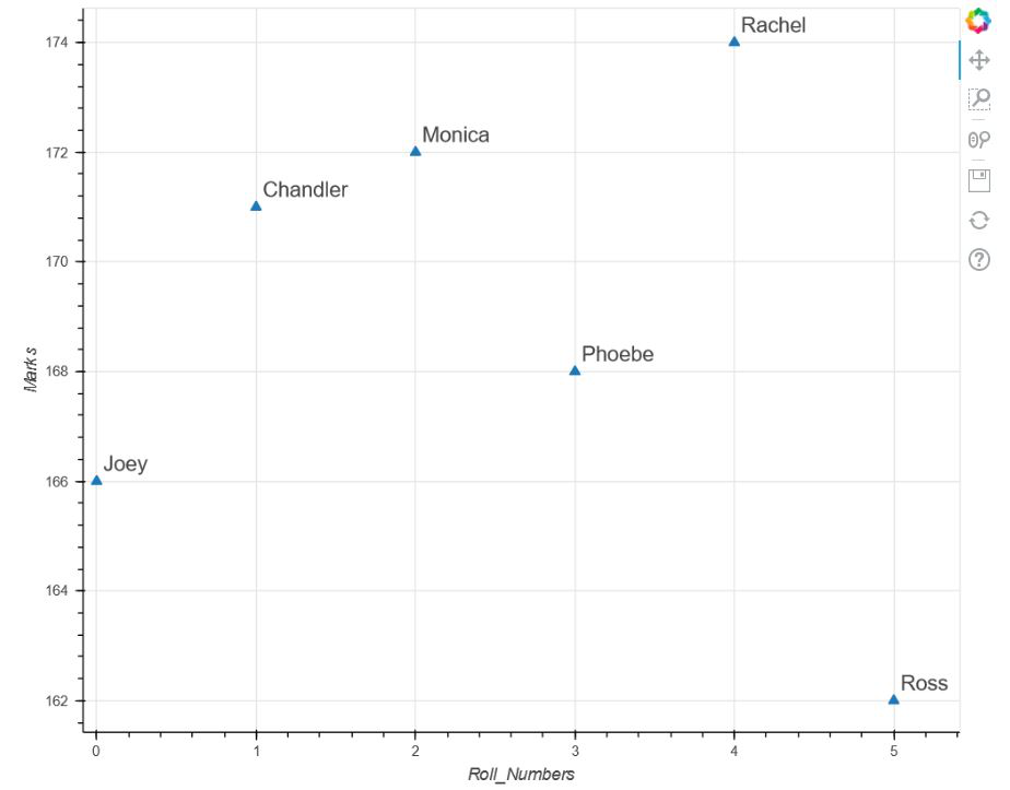
在这个例子中,我们将讨论标签的另一个属性,即LabelSet。但是在上代码之前,我们应该对什么是LabelSet有一个简单的了解。现在,从前面的例子中,我们可以清楚地看到,在标签的帮助下,我们只能在图中标记一个点,即“第二点”。但是如果我们想标记所有的点,那么每次都重复代码是没有意义的。因此,在这种情况下,bokeh 提出了一个称为 LabelSet 的包,它可以帮助我们在图中标记多个点而无需重复。在此示例中,我们将使用另一个包,即ColumnDataSource 。 ColumnDataSource 为我们提供了列名与值序列的映射。
现在,让我们转到代码以查看实现:
代码:
蟒蛇3
# importing figure from
# Bokeh.plotting
from bokeh.plotting import figure

# importing ColumnDataSource and LabelSet
# from bokeh.models
from bokeh.models import ColumnDataSource, LabelSet

# import show from broken.io module
from bokeh.io import show


# Using ColumnDataSource we are providing
# Column names to a sequence of values
source = ColumnDataSource(data=dict(
    marks=[166, 171, 172, 168, 174, 162],
    roll_no=[0, 1, 2, 3, 4, 5],
    names=['Joey', 'Chandler', 'Monica',
           'Phoebe', 'Rachel', 'Ross']))

# Creating an empty figure
p = figure(plot_width=750, plot_height=600)

# Plotting the data in the form of triangle
p.triangle(x='roll_no', y='marks', size=8, source=source)

# Labelling the X-Axis
p.xaxis.axis_label = 'Roll_Numbers'

# Labelling the Y-Axis
p.yaxis.axis_label = 'Marks'

# Using LabelSet, we are labelling each of the
# points with names created in source
labels = LabelSet(x='roll_no', y='marks', text='names',
                  x_offset=5, y_offset=5, source=source)

Adding that label to our figure
p.add_layout(labels)

# Showing the above plot
show(p)
输出:
最后但并非最不重要的是,我们将学习另一个注释,即legend_label,它帮助我们区分图形中的多个图。通过使用标签“legend_label”,我们实际上是在定义图的名称,该名称将显示在图形的右上角。
代码:
蟒蛇3
# import numpy package
import numpy as np

# importing figure and show from
# bokeh.plotting
from bokeh.plotting import figure, show


# Creating an array of 100 numbers
# between 0 to 1 using linespace
x = np.linspace(0, 1, 100)

# Creating an array of sin
# values of x in y
y = np.sin(x)

# Creating an empty figure
p = figure(plot_width=500, plot_height=500)

# Creating the first plot with color as red and label as
# sin(x)
p.circle(x, y, legend_label="1st Plot", color="red")

# Drawing a line through all the points with the
# same color
p.line(x, y, legend_label="1st Plot", line_color="red")

# Drawing the second plot as yellow and labelling as
# the 2nd plot
p.circle(x, y**3, legend_label="2nd Plot", color="yellow")

# Drawing a line through all the points of the
# second plot
p.line(x, y**3, legend_label="2nd Plot", line_color="yellow", line_width=2)

# showing the above plot
show(p)
输出:
