散景中的字形
Bokeh 是一个Python库,用于创建交互式数据可视化。在本文中,我们将讨论散景中的字形。但首先让我们看看如何在Python中安装 Bokeh。
安装
要安装此类型,请在终端中输入以下命令。
conda install bokeh
Or
pip install bokeh
用字形绘图
通常,绘图由线条、圆形等形式的几何形状组成。 因此,字形只是绘制来表示数据的视觉形状,例如圆形、正方形、线条、矩形等。
创建基本折线图:
折线图以线的形式显示 x 和 y 轴点移动的可视化。要在图形上绘制线条字形,我们使用图形对象的 line() 方法。
句法:
my_plot.line(a, b, line_width) 代码:
Python
# import the libraries
from bokeh.plotting import figure, show, output_file

# prepare some data
a = [1, 2, 3, 4, 5, 6, 7, 8, 9, 10]
b = [2, 4, 6, 8, 10, 12, 14, 16, 18, 20]

# create a plot using figure
my_plot = figure(title="simple line chart", x_axis_label="X-Axis",
                 y_axis_label="Y-Axis")

# adding line graph
my_plot.line(a, b, line_width=3)

# display output in file
output_file("line.html")

# show the result
show(my_plot)
Python
from bokeh.plotting import figure, show
from bokeh.io import output_notebook


# prepare some data
x1 = [1, 3, 4, 5, 6]
x2 = [5, 3, 8, 1, 8]
y1 = [6, 7, 8, 9, 4]
y2 = [3, 4, 5, 6, 7]

# create a new plot
p = figure(title="Drawing multiple lines",
           x_axis_label="X-Axis", y_axis_label="Y-Axis")

# add multiple renderers
p.line(x1, y1, legend_label="line 1", line_color="red", line_width=1)
p.line(x2, y2, legend_label="line 2", line_color="blue", line_width=1)
p.line(x1, y2, legend_label="line 3", line_color="black", line_width=1)

output_notebook()
show(p)
Python
from bokeh.plotting import figure, show
from bokeh.io import output_file

# prepare some data
x = [1, 2, 4, 6, 7]
y = [7, 6, 3, 9, 10]

# create a new plot with figure function
p = figure(title="Circle Glyph", plot_width=450, plot_height=400)

# create circle glyph
p.circle(x=x, y=y, size=25, fill_color="red")
p.circle_cross(x=[2, 4, 6, 8], y=[5, 8, 9, 11], size=25,
               fill_color="blue", fill_alpha=0.3, line_width=2)
p.circle_x(x=[4, 7, 2, 6], y=[7, 2, 4, 9], size=25,
           fill_color="green", fill_alpha=0.6, line_width=2)

# show the results
output_file('circle.html')
show(p)
Python
# Bokeh libraries
from bokeh.io import output_notebook
from bokeh.plotting import figure, show

# data
day = [1, 2, 3, 4, 5, 6, 7, 8, 9, 10]
no_orders = [450, 628, 488, 210, 287,
             791, 508, 639, 397, 943]

# Output the visualization directly in the notebook
output_notebook()

# Create a figure
p = figure(title='Bar chart',
           plot_height=400, plot_width=600,
           x_axis_label='Day', y_axis_label='Orders Recieved',
           x_minor_ticks=2, y_range=(0, 1000),
           toolbar_location=None)

# The daily orders will be represented as vertical
# bars (columns)
p.vbar(x=day, bottom=0, top=no_orders,
       color='blue', width=0.75, fill_color='red',
       legend_label='Orders')

# Let's check it out
show(p)
Python
# Bokeh libraries
from bokeh.plotting import figure, show, output_file

# data
day = [1, 2, 3, 4, 5, 6, 7, 8, 9, 10]
no_orders = [450, 628, 488, 210, 287, 791,
             508, 639, 397, 943]

# Create a figure
p = figure(title='Bar chart',
           plot_height=400, plot_width=600,
           x_axis_label='Orders Recieved', y_axis_label='Day',
           x_range=(0, 1000), toolbar_location=None)

# The daily orders will be represented as
# horizontal bars
p.hbar(y=day, height=0.5, left=0, right=no_orders,
       color='blue', width=0.75, fill_color='red',
       legend_label='Orders')

# Let's check it out
show(p)
output_file("ex.html")
Python
# Bokeh libraries
from bokeh.plotting import figure, show, output_file

# data
x = [1, 2, 3, 4, 5]
y = [6, 7, 8, 5, 2]

# Create a figure
p = figure(title='Patch Glyph',
           plot_height=400, plot_width=600,
           x_axis_label='x', y_axis_label='y',
           toolbar_location=None)

# add patch glyph
p.patch(x, y, fill_color="blue", line_color='black',
        alpha=0.5, line_width=2)

# show the results
show(p)
output_file("ex.html")
Python
# Bokeh libraries
from bokeh.plotting import figure, show, output_file

# data
x = [[1, 2, 3], [4, 6, 8], [2, 4, 5, 4]]
y = [[2, 5, 6], [3, 6, 7], [2, 4, 7, 8]]

# Create a figure
p = figure(title='Patch Glyph',
           plot_height=400, plot_width=600,
           x_axis_label='x', y_axis_label='y',
           toolbar_location=None)

# add patches glyph
p.patches(x, y, fill_color=["blue", "green", "yellow"], line_width=2)

# show the results
show(p)
output_file("ex.html")
输出:

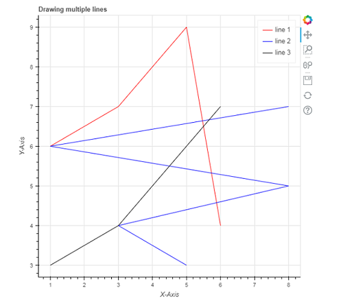
组合多个图形
您还可以使用 bokeh.plotting 界面添加多个图形。为此,您只需要通过传递不同的数据作为参数来多次调用 line()函数,如示例所示。
句法:
p.line(x1, y2, legend_label, line_color, line_width)代码:
Python
from bokeh.plotting import figure, show
from bokeh.io import output_notebook


# prepare some data
x1 = [1, 3, 4, 5, 6]
x2 = [5, 3, 8, 1, 8]
y1 = [6, 7, 8, 9, 4]
y2 = [3, 4, 5, 6, 7]

# create a new plot
p = figure(title="Drawing multiple lines",
           x_axis_label="X-Axis", y_axis_label="Y-Axis")

# add multiple renderers
p.line(x1, y1, legend_label="line 1", line_color="red", line_width=1)
p.line(x2, y2, legend_label="line 2", line_color="blue", line_width=1)
p.line(x1, y2, legend_label="line 3", line_color="black", line_width=1)

output_notebook()
show(p)
输出:
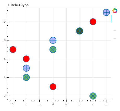
渲染圆圈
为了将圆形字形添加到您的绘图中,我们使用 circle() 方法而不是上面示例中使用的 line() 方法。
Circle():我们使用此方法向绘图添加圆形字形。它以中心的 x 和 y 坐标作为参数。除此之外,它还需要参数,如大小、填充颜色、填充阿尔法、角度、线颜色、线阿尔法、半径、半径尺寸等
句法:
p.circle(x, y, size, fill_color)Criss_cross():此方法通过圆心添加一个带有“+”标记的圆字形,并获取中心的 x 和 y 坐标。
句法:
p.circle_cross(x, y, size, fill_color, fill_alpha, line_width)
Circle_X() :此方法通过圆心添加一个带有“X”标记的圆字形,并获取中心的 x 和 y 坐标。
句法:
p.circle_x(x, y, size,fill_color, fill_alpha, line_width)
代码:
Python
from bokeh.plotting import figure, show
from bokeh.io import output_file

# prepare some data
x = [1, 2, 4, 6, 7]
y = [7, 6, 3, 9, 10]

# create a new plot with figure function
p = figure(title="Circle Glyph", plot_width=450, plot_height=400)

# create circle glyph
p.circle(x=x, y=y, size=25, fill_color="red")
p.circle_cross(x=[2, 4, 6, 8], y=[5, 8, 9, 11], size=25,
               fill_color="blue", fill_alpha=0.3, line_width=2)
p.circle_x(x=[4, 7, 2, 6], y=[7, 2, 4, 9], size=25,
           fill_color="green", fill_alpha=0.6, line_width=2)

# show the results
output_file('circle.html')
show(p)
输出:
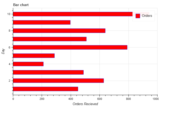
渲染条
类似地,我们可以使用 vbar()函数渲染竖条,使用 hbar()函数渲染水平条。
创建 vbar
要绘制 vbar,我们指定中心 x 坐标、底部和顶部端点,如下例所示:
句法:
p.vbar(x, bottom, top,
color, width, fill_color,legend_label)
代码:
Python
# Bokeh libraries
from bokeh.io import output_notebook
from bokeh.plotting import figure, show

# data
day = [1, 2, 3, 4, 5, 6, 7, 8, 9, 10]
no_orders = [450, 628, 488, 210, 287,
             791, 508, 639, 397, 943]

# Output the visualization directly in the notebook
output_notebook()

# Create a figure
p = figure(title='Bar chart',
           plot_height=400, plot_width=600,
           x_axis_label='Day', y_axis_label='Orders Recieved',
           x_minor_ticks=2, y_range=(0, 1000),
           toolbar_location=None)

# The daily orders will be represented as vertical
# bars (columns)
p.vbar(x=day, bottom=0, top=no_orders,
       color='blue', width=0.75, fill_color='red',
       legend_label='Orders')

# Let's check it out
show(p)
输出:

创建 hbar
要绘制 hbar ,我们指定中心 y 坐标、左右端点和高度,如下例所示:
句法:
p.hbar(y, height, left, right,
 color, width, fill_color,
legend_label)示例代码:
Python
# Bokeh libraries
from bokeh.plotting import figure, show, output_file

# data
day = [1, 2, 3, 4, 5, 6, 7, 8, 9, 10]
no_orders = [450, 628, 488, 210, 287, 791,
             508, 639, 397, 943]

# Create a figure
p = figure(title='Bar chart',
           plot_height=400, plot_width=600,
           x_axis_label='Orders Recieved', y_axis_label='Day',
           x_range=(0, 1000), toolbar_location=None)

# The daily orders will be represented as
# horizontal bars
p.hbar(y=day, height=0.5, left=0, right=no_orders,
       color='blue', width=0.75, fill_color='red',
       legend_label='Orders')

# Let's check it out
show(p)
output_file("ex.html")
输出:
补丁字形
补丁字形以特定颜色对空间区域进行着色。我们使用 patch() 方法开发单个补丁,使用 patch() 方法开发多个补丁。
单补丁
句法:
p.patch(x, y, fill_color, line_color, alpha, line_width)代码:
Python
# Bokeh libraries
from bokeh.plotting import figure, show, output_file

# data
x = [1, 2, 3, 4, 5]
y = [6, 7, 8, 5, 2]

# Create a figure
p = figure(title='Patch Glyph',
           plot_height=400, plot_width=600,
           x_axis_label='x', y_axis_label='y',
           toolbar_location=None)

# add patch glyph
p.patch(x, y, fill_color="blue", line_color='black',
        alpha=0.5, line_width=2)

# show the results
show(p)
output_file("ex.html")
输出:

多个补丁
可以通过使用函数patch() 而不是 patch() 以类似的方式创建多个补丁。在下面显示的示例中,我们以数组列表的形式传递数据,以创建具有不同颜色的三个补丁。
代码:
Python
# Bokeh libraries
from bokeh.plotting import figure, show, output_file

# data
x = [[1, 2, 3], [4, 6, 8], [2, 4, 5, 4]]
y = [[2, 5, 6], [3, 6, 7], [2, 4, 7, 8]]

# Create a figure
p = figure(title='Patch Glyph',
           plot_height=400, plot_width=600,
           x_axis_label='x', y_axis_label='y',
           toolbar_location=None)

# add patches glyph
p.patches(x, y, fill_color=["blue", "green", "yellow"], line_width=2)

# show the results
show(p)
output_file("ex.html")
输出:
