在Python中使用 Plotly 绘制等高线图
Plotly 是一个Python库,用于设计图形,尤其是交互式图形。它可以绘制各种图形和图表,如直方图、条形图、箱线图、散布图等等。它主要用于数据分析和财务分析。 plotly 是一个交互式可视化库。
Plotly 中的等高线图
等高线图具有两个曲线变量的函数,沿该函数具有恒定值,因此这些曲线连接具有相等值的点。在等高线图中,二维等高线图表示二维数值数组 z 的等高线,即 z 的 iso 值的插值线。
Syntax: plotly.graph_objects.Contour(arg=None,colorbar=None, hoverinfo=None, x=None,y=None,**kwargs)
Parameters:
arg: dict of properties compatible with this constructor or an instance of plotly.graph_objects.Contour
colorbar: plotly.graph_objects.contour.ColorBar instance or dict with compatible properties
x: Sets the x coordinates.
y: Sets the y coordinates.
z: Sets the z coordinates.
hoverinfo: Determines which trace information appear on hover. If none or skip are set, no information is displayed upon hovering. But, if none is set, click and hover events are still fired.
示例 1:创建一个简单的等值线图
Python3
import plotly.graph_objects as go
import numpy as np

data = [[1,2,3,4,5],
     [3,4,5,6,7],
     [7,8,9,6,4],
     [3,7,2,4,2]]

fig = go.Figure(data =
     go.Contour(z = data))

fig.show()
Python3
import plotly.graph_objects as go

feature_x = np.arange(0, 50, 2)
feature_y = np.arange(0, 50, 3)

# Creating 2-D grid of features
[X, Y] = np.meshgrid(feature_x, feature_y)

Z = np.cos(X / 2) + np.sin(Y / 4)

fig = go.Figure(data =
     go.Contour(x = feature_x, y = feature_y, z = Z))

fig.show()
Python3
import plotly.graph_objects as go

feature_x = np.arange(0, 50, 2)
feature_y = np.arange(0, 50, 3)

# Creating 2-D grid of features
[X, Y] = np.meshgrid(feature_x, feature_y)

Z = np.cos(X / 2) + np.sin(Y / 4)

fig = go.Figure(data =
     go.Contour(x = feature_x, y = feature_y, z = Z,
               colorscale='rainbow'
               ))

fig.show()
Python3
import plotly.graph_objects as go

feature_x = np.arange(0, 50, 2)
feature_y = np.arange(0, 50, 3)

colorscale = colorscale = [[0, 'green'], [0.5, 'red'],
                           [1.0, 'rgb(0, 0, 255)']]

# Creating 2-D grid of features
[X, Y] = np.meshgrid(feature_x, feature_y)

Z = np.cos(X / 2) + np.sin(Y / 4)

fig = go.Figure(data =
     go.Contour(x = feature_x, y = feature_y, z = Z,
               colorscale = colorscale))

fig.show()
Python3
import plotly.graph_objects as go

feature_x = np.arange(0, 50, 2)
feature_y = np.arange(0, 50, 3)

# Creating 2-D grid of features
[X, Y] = np.meshgrid(feature_x, feature_y)

Z = np.cos(X / 2) + np.sin(Y / 4)

fig = go.Figure(data =
     go.Contour(x = feature_x,
                y = feature_y, z = Z,

            contours=dict(
                start=1,
                end=5,
                size=.2)
               )
               )

fig.show()
Python3
import plotly.graph_objects as go

feature_x = np.arange(0, 50, 2)
feature_y = np.arange(0, 50, 3)

# Creating 2-D grid of features
[X, Y] = np.meshgrid(feature_x, feature_y)

Z = np.cos(X / 2) + np.sin(Y / 4)

fig = go.Figure(data=go.Contour(
    x=feature_x, y=feature_y, z=Z,
    contours=dict(
        coloring='lines',
        showlabels=True,)
))

fig.show()
输出:
示例 2:使用 X 和 Y 坐标创建等高线图。
Python3
import plotly.graph_objects as go

feature_x = np.arange(0, 50, 2)
feature_y = np.arange(0, 50, 3)

# Creating 2-D grid of features
[X, Y] = np.meshgrid(feature_x, feature_y)

Z = np.cos(X / 2) + np.sin(Y / 4)

fig = go.Figure(data =
     go.Contour(x = feature_x, y = feature_y, z = Z))

fig.show()
输出:

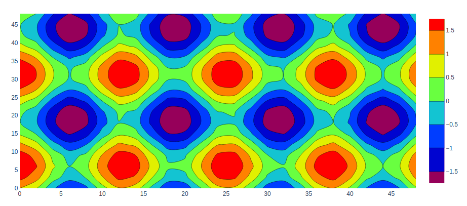
添加色阶
在 plotly 中,等高线图的色标用于添加不同的颜色,可以使用 colorscale 参数进行设置。
例子:
Python3
import plotly.graph_objects as go

feature_x = np.arange(0, 50, 2)
feature_y = np.arange(0, 50, 3)

# Creating 2-D grid of features
[X, Y] = np.meshgrid(feature_x, feature_y)

Z = np.cos(X / 2) + np.sin(Y / 4)

fig = go.Figure(data =
     go.Contour(x = feature_x, y = feature_y, z = Z,
               colorscale='rainbow'
               ))

fig.show()
输出:
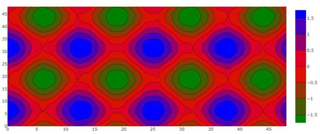
自定义等高线图色标
在这里,我们可以使用色标自定义等高线图。将均匀分布以创建色标的颜色列表。许多预定义的色阶列表包含在顺序的、发散的中。
以下颜色集可用于色阶。
‘aggrnyl’, ‘agsunset’, ‘algae’, ‘amp’, ‘armyrose’, ‘balance’, ‘blackbody’, ‘bluered’, ‘blues’, ‘blugrn’, ‘bluyl’, ‘brbg’,’brwnyl’, ‘bugn’, ‘bupu’, ‘burg’, ‘burgyl’, ‘cividis’, ‘curl’, ‘darkmint’, ‘deep’, ‘delta’, ‘dense’, ‘earth’, ‘edge’, ‘electric’, ’emrld’, ‘fall’, ‘geyser’, ‘gnbu’, ‘gray’, ‘greens’, ‘greys’,’haline’, ‘hot’, ‘hsv’, ‘ice’, ‘icefire’, ‘inferno’, ‘jet’, ‘magenta’, ‘magma’, ‘matter’, ‘mint’, ‘mrybm’, ‘mygbm’, ‘oranges’, ‘orrd’, ‘oryel’, ‘oxy’, ‘peach’, ‘phase’, ‘picnic’, ‘pinkyl’, ‘piyg’, ‘plasma’, ‘plotly3’, ‘portland’, ‘prgn’, ‘pubu’, ‘pubugn’,’puor’, ‘purd’, ‘purp’, ‘purples’, ‘purpor’, ‘rainbow’, ‘rdbu’, ‘rdgy’, ‘rdpu’, ‘rdylbu’, ‘rdylgn’, ‘redor’, ‘reds’, ‘solar’, ‘spectral’, ‘speed’, ‘sunset’, ‘sunsetdark’, ‘teal’, ‘tealgrn’, ‘tealrose’, ‘tempo’, ‘temps’, ‘thermal’, ‘tropic’, ‘turbid’, ‘turbo’, ‘twilight’, ‘viridis’, ‘ylgn’, ‘ylgnbu’, ‘ylorbr’, ‘ylorrd’].
例子:
Python3
import plotly.graph_objects as go

feature_x = np.arange(0, 50, 2)
feature_y = np.arange(0, 50, 3)

colorscale = colorscale = [[0, 'green'], [0.5, 'red'],
                           [1.0, 'rgb(0, 0, 255)']]

# Creating 2-D grid of features
[X, Y] = np.meshgrid(feature_x, feature_y)

Z = np.cos(X / 2) + np.sin(Y / 4)

fig = go.Figure(data =
     go.Contour(x = feature_x, y = feature_y, z = Z,
               colorscale = colorscale))

fig.show()
输出:
自定义大小和范围
我们可以使用轮廓属性自定义轮廓图的大小和范围。轮廓接受包含坐标范围和大小的dict 对象。
Python3
import plotly.graph_objects as go

feature_x = np.arange(0, 50, 2)
feature_y = np.arange(0, 50, 3)

# Creating 2-D grid of features
[X, Y] = np.meshgrid(feature_x, feature_y)

Z = np.cos(X / 2) + np.sin(Y / 4)

fig = go.Figure(data =
     go.Contour(x = feature_x,
                y = feature_y, z = Z,

            contours=dict(
                start=1,
                end=5,
                size=.2)
               )
               )

fig.show()
输出:

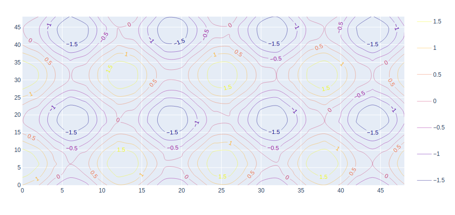
在等高线上添加标签
可以使用具有名为showlabels的属性的 contours 参数添加标签。它决定是否用它们的值标记等高线。
例子:
Python3
import plotly.graph_objects as go

feature_x = np.arange(0, 50, 2)
feature_y = np.arange(0, 50, 3)

# Creating 2-D grid of features
[X, Y] = np.meshgrid(feature_x, feature_y)

Z = np.cos(X / 2) + np.sin(Y / 4)

fig = go.Figure(data=go.Contour(
    x=feature_x, y=feature_y, z=Z,
    contours=dict(
        coloring='lines',
        showlabels=True,)
))

fig.show()
输出: