如何在 R 中的 ggplot2 中将图例折叠成两行
在本文中,我们将看到如何在 R 编程语言中绘制具有两行的 ggplot2 图例。
如果我们想用两行绘制ggplot2 Legend,我们必须在theme()函数添加guides和guide_legend函数。在 guides()函数,我们取名为 color 的参数,该参数调用了 guide_legend() 引导函数作为值。
在 guide_legend()函数,我们接受一个名为 nrow 的参数,它具有所需的图例行数作为值。
Syntax : guide_legend(nrow)
Parameter :
nrow : The Desired Number of rows of legend.
Return : Legend Guides for various scales
使用中的数据框:
Batch Students Class
1 2017 2300 DSA Essential
2 2018 1200 Placement100
3 2019 3500 C++: Expert
4 2020 1400 Web Development Bootcamp
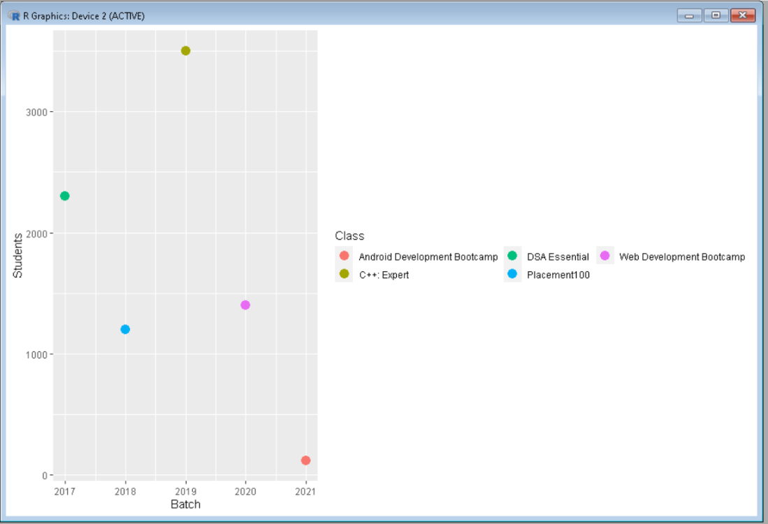
5 2021 120 Android Development Bootcamp要创建 R 图,我们使用 ggplot()函数,并添加 geom_point()函数使其成为散点图,将整个图分配给 gplot 数据对象。让我们首先创建一个规则图,以便差异明显。
示例:默认图例
R
library("ggplot2")

# Create a DataFrame
data <- data.frame(Batch = c(2017, 2018, 2019, 2020, 2021),
                   Students = c(2300, 1200, 3500, 1400, 120),
                   Class = c("DSA Essential", "Placement100",
                             "C++: Expert", "Web Development Bootcamp",
                             "Android DevelopmentBootcamp"))

# Create a ggplot2 scatter plot
ggplot(data, aes(Batch, Students, color = Class)) +
geom_point(size = 4)
R
library("ggplot2")

# Create a DataFrame
data <- data.frame(Batch = c(2017, 2018, 2019, 2020, 2021),
                   Students = c(2300, 1200, 3500, 1400, 120),
                   Class = c("DSA Essential", "Placement100",
                             "C++: Expert", "Web Development Bootcamp",
                             "Android Development Bootcamp"))

# Create a ggplot2 scatter plot
ggplot(data, aes(Batch, Students, color = Class)) +
geom_point(size = 4) +
guides(color = guide_legend(nrow = 2))
输出:
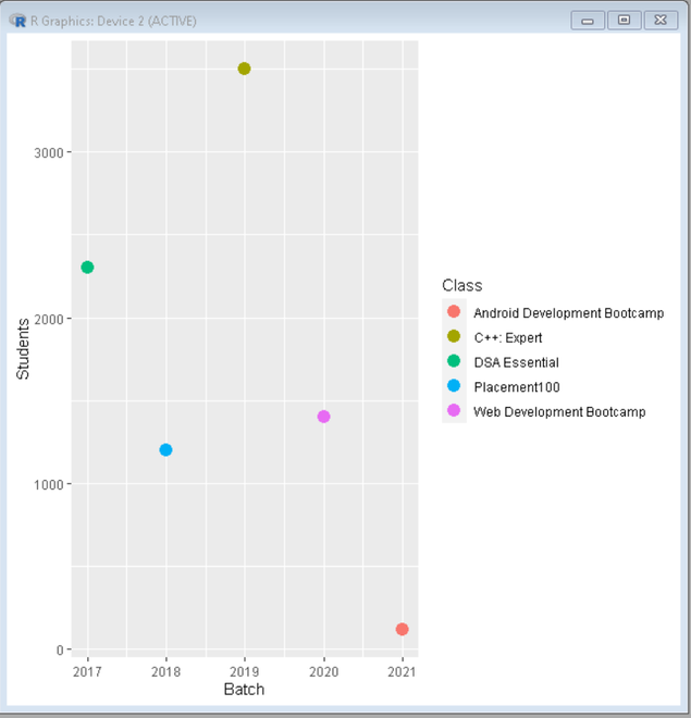
现在折叠图例,添加guides()函数,颜色为guide_legend(),参数nrow=2,将图例折叠成两行。
示例:图例折叠成 2 行
电阻
library("ggplot2")

# Create a DataFrame
data <- data.frame(Batch = c(2017, 2018, 2019, 2020, 2021),
                   Students = c(2300, 1200, 3500, 1400, 120),
                   Class = c("DSA Essential", "Placement100",
                             "C++: Expert", "Web Development Bootcamp",
                             "Android Development Bootcamp"))

# Create a ggplot2 scatter plot
ggplot(data, aes(Batch, Students, color = Class)) +
geom_point(size = 4) +
guides(color = guide_legend(nrow = 2))
输出: