使用Python可视化和预测作物生产数据
先决条件: Python中的数据可视化
可视化 正在查看各个维度的数据。在Python中,我们可以使用不同模块中可用的各种图来可视化数据。
在本文中,我们将使用各种插图和Python库对不同年份的作物生产数据进行可视化和预测。
数据集
数据集包含 2013 年至 2020 年的不同作物及其产量。
要求
有很多Python库可用于构建可视化,如matplotlib、vispy、bokeh、seaborn、pygal、folium、plotly、cufflinks和networkx 。其中, matplotlib和seaborn似乎非常广泛地用于基础到中级的可视化。
然而,以上两个被广泛用于可视化,即
- Matplotlib:它是一个出色的Python中用于二维数组绘图的可视化库,它是一个多平台数据可视化库,构建在NumPy数组上,旨在与更广泛的SciPy堆栈一起使用。使用以下命令安装此库:
pip install matplotlib
- Seaborn:这个库位于matplotlib之上。从某种意义上说,它有一些matpotlib的味道,而从可视化的角度来看,它比matplotlib好得多,并且还增加了一些功能。使用以下命令安装此库:
pip install seaborn
循序渐进的方法
- 导入所需模块
- 加载数据集。
- 显示加载数据集的数据和约束。
- 使用不同的方法从数据中可视化各种插图。
可视化
以下是一些指示数据并说明该数据的各种可视化的程序:
示例 1:
Python3
# importing pandas module
import pandas as pd

# load the dataset
data = pd.read_csv('crop.csv')

# display top 5 values
data.head()
Python3
# data description
data.info()
Python3
# 2011 crop data in histogram analysis
data['2011'].hist()
Python3
# 2012 crop data in histogram analysis
data['2012'].hist()
Python3
# 2013 crop data in histogram analysis
data['2013'].hist()
Python3
# display all year data
data.hist()
Python3
# import seaborn module
import seaborn as sns

# setting style
sns.set_style("whitegrid")

# plotting data using boxplot for 2013 - 2014
sns.boxplot(x='2013', y='2014', data=data)
Python3
# scatter plot 2013 data vs 2014 data
plt.scatter(data['2013'],data['2014'])

plt.show()
Python3
# line plot 2013 data vs 2014 data
plt.plot(data['2013'],data['2014'])

plt.show()
Python3
# import required modules
import matplotlib.pyplot as plt
from scipy import stats


# assign data
x = data['2017']
y = data['2018']


# linear regression 2017 data vs 2018 data
slope, intercept, r, p, std_err = stats.linregress(x, y)


# function to return slope
def myfunc(x):
    return slope * x + intercept


mymodel = list(map(myfunc, x))

# scatter
plt.scatter(x, y)

# plotting the data
plt.plot(x, mymodel)

# display the figure
plt.show()
Python3
# import required modules
import matplotlib.pyplot as plt
from scipy import stats


# assign data
x = data['2016']
y = data['2017']


# linear regression 2017 data vs 2018 data
slope, intercept, r, p, std_err = stats.linregress(x, y)


# function to return slope
def myfunc(x):
    return slope * x + intercept


mymodel = list(map(myfunc, x))

# scatter
plt.scatter(x, y)

# plotting the data
plt.plot(x, mymodel)

# display the figure
plt.show()
输出:

这些是所用数据集的前 5 行。
示例 2:
蟒蛇3
# data description
data.info()
输出:

这些是数据集的数据约束。
示例 3:
蟒蛇3
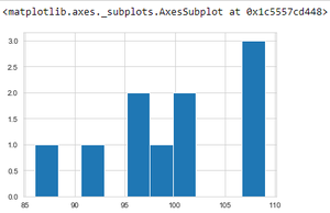
# 2011 crop data in histogram analysis
data['2011'].hist()
输出:

上述程序使用直方图描述了 2011 年的作物产量数据。
示例 4:
蟒蛇3
# 2012 crop data in histogram analysis
data['2012'].hist()
输出:
上述程序使用直方图描述了 2012 年的作物产量数据。
示例 4:
蟒蛇3
# 2013 crop data in histogram analysis
data['2013'].hist()
输出:

上述程序使用直方图描述了 2013 年的作物产量数据。
示例 5:
蟒蛇3
# display all year data
data.hist()
输出:

上述程序使用多个直方图描述了所有可用时间段(年)的作物产量数据。
示例 6:
蟒蛇3
# import seaborn module
import seaborn as sns

# setting style
sns.set_style("whitegrid")

# plotting data using boxplot for 2013 - 2014
sns.boxplot(x='2013', y='2014', data=data)
输出:

使用箱线图比较 2013 年和 2014 年的作物产量。
示例 7:
蟒蛇3
# scatter plot 2013 data vs 2014 data
plt.scatter(data['2013'],data['2014'])

plt.show()
输出:
使用散点图比较 2013 年和 2014 年的作物产量。
示例 8:
蟒蛇3
# line plot 2013 data vs 2014 data
plt.plot(data['2013'],data['2014'])

plt.show()
输出:

使用线图比较 2013 年和 2014 年的作物产量。
示例 9:
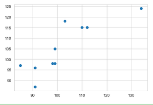
蟒蛇3
# import required modules
import matplotlib.pyplot as plt
from scipy import stats


# assign data
x = data['2017']
y = data['2018']


# linear regression 2017 data vs 2018 data
slope, intercept, r, p, std_err = stats.linregress(x, y)


# function to return slope
def myfunc(x):
    return slope * x + intercept


mymodel = list(map(myfunc, x))

# scatter
plt.scatter(x, y)

# plotting the data
plt.plot(x, mymodel)

# display the figure
plt.show()
输出:

应用线性回归来可视化和比较 2017 年和 2018 年之间的预测作物产量数据。
示例 10:
蟒蛇3
# import required modules
import matplotlib.pyplot as plt
from scipy import stats


# assign data
x = data['2016']
y = data['2017']


# linear regression 2017 data vs 2018 data
slope, intercept, r, p, std_err = stats.linregress(x, y)


# function to return slope
def myfunc(x):
    return slope * x + intercept


mymodel = list(map(myfunc, x))

# scatter
plt.scatter(x, y)

# plotting the data
plt.plot(x, mymodel)

# display the figure
plt.show()
输出:

应用线性回归来可视化和比较 2016 年和 2017 年之间的预测作物产量数据。
演示视频
该视频展示了如何使用 Jupyter Notebook 从头开始描绘上述数据可视化和预测数据。
通过这种方式,可以计算各种数据可视化和预测。