使用 Plotly Express 的动画数据可视化
数据可视化是数据科学行业的一件大事,向企业或政府显示适当的统计数据可以极大地帮助他们改善服务。从多个图表中理解不同时间的数据并从中理解是非常痛苦的。这就是对动画数据可视化的需求所在。在这篇文章中,我们将使用 Plotly Express 对来自 Gapminder 的数据和数据集进行绘图和动画处理。我们将看看 Plotly Express 提供的不同类型的动画。
安装
确保您的计算机中安装了Python 3。安装将用于动画数据的 Plotly。要安装它,请在终端中键入以下命令。
pip install plotly
如果您不想在计算机上本地安装模块,请使用 Jupyter Notebooks 或 Google Colab。
导入模块和数据集
我们需要从 Gapminder 导入 Plotly Express 和世界数据。
import plotly.express as px
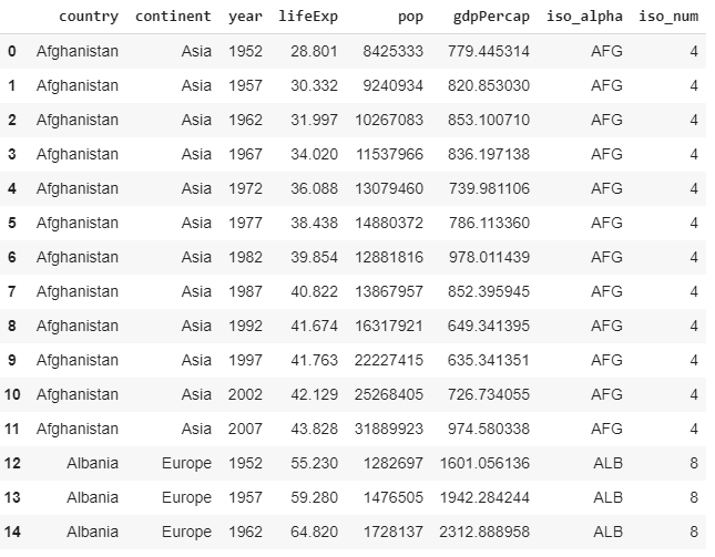
gapminder = px.data.gapminder()示例:让我们打印该数据库的前几行
Python3
import plotly.express as px

gapminder = px.data.gapminder()
gapminder.head(15)
Python3
import plotly.express as px


gapminder = px.data.gapminder()
gapminder.head(15)

fig = px.choropleth(gapminder,
                    locations ="iso_alpha",
                    color ="lifeExp",
                    hover_name ="country",
                    color_continuous_scale = px.colors.sequential.Plasma,
                    scope ="world",
                    animation_frame ="year")
fig.show()
Python3
import plotly.express as px


gapminder = px.data.gapminder()
gapminder.head(15)

fig = px.bar(gapminder,
             x ="continent",
             y ="pop",
             color ='lifeExp',
             animation_frame ='year',
             hover_name ='country',
             range_y =[0, 4000000000])
fig.show()
Python3
import plotly.express as px


gapminder = px.data.gapminder()
gapminder.head(15)

fig = px.density_contour(gapminder,
                         x ="gdpPercap",
                         y ="lifeExp",
                         color ="continent",
                         marginal_y ="histogram",
                         animation_frame ='year',
                         animation_group ='country',
                         range_y =[25, 100])
fig.show()
Python3
import plotly.express as px


gapminder = px.data.gapminder()
gapminder.head(15)

fig = px.scatter(
    gapminder,
    x ="gdpPercap",
    y ="lifeExp",
    animation_frame ="year",
    animation_group ="country",
    size ="pop",
    color ="continent",
    hover_name ="country",
    facet_col ="continent",
    size_max = 45,
    range_y =[25, 90]
)
fig.show()
输出:
来自 Gapminder 的数据
现在我们已经获得了世界上几乎所有国家从1952年到2007年的预期寿命、人均GDP和人口等数据。
预期寿命
等值线是一张地图,它使用关于共同财产的定义区域的颜色差异,以便将数据可视化为区域(在本例中为国家)的汇总摘要。 Plotly Express 可以轻松绘制等值线图。下面的代码显示了如何从gapminder 获取信息。设置要将等值线着色到的参数。在这里,我们希望等值线根据预期寿命 ( lifeExp ) 对区域进行着色。 hover_name显示悬停时设置的数据。 animation_frame是指动画应该在哪个参数上完成(大多数情况下,这个参数是时间序列数据)。
例子:
Python3
import plotly.express as px


gapminder = px.data.gapminder()
gapminder.head(15)

fig = px.choropleth(gapminder,
                    locations ="iso_alpha",
                    color ="lifeExp",
                    hover_name ="country",
                    color_continuous_scale = px.colors.sequential.Plasma,
                    scope ="world",
                    animation_frame ="year")
fig.show()
输出:
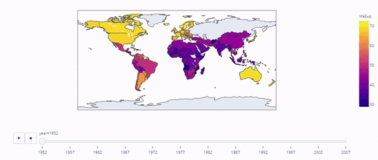
1952 年至 2007 年各国的预期寿命
范围是指等值线范围的区域。例如,如果我们输入scope=”asia” ,将显示以下内容:
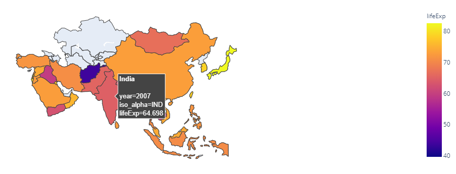
亚洲的预期寿命
人口条形图
现在让我们使用相同的数据集制作一个动画条形图,在这个实例中使用人口作为我们的主要数据。让数据的x为大陆, y为人口,当悬停在国家/地区名称上时应显示。所以让我们将hover设置为'country' 。指定范围很重要,因为它有助于理解我们正在处理的数据的规模。完成动画的参数当然是年份。
例子:
Python3
import plotly.express as px


gapminder = px.data.gapminder()
gapminder.head(15)

fig = px.bar(gapminder,
             x ="continent",
             y ="pop",
             color ='lifeExp',
             animation_frame ='year',
             hover_name ='country',
             range_y =[0, 4000000000])
fig.show()
输出:
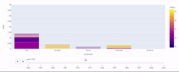
人口
人均 GDP 与预期寿命密度等值线
跨时间的预期寿命与人均 GDP 之间的关系是政府或国家数据统计的重要组成部分。政府可以(并且已经)使用它来建立两者之间的相关性,从而解释了为什么预期寿命的增加也增加了人均 GDP。该方法可以使用密度等高线图和直方图进行可视化。
例子:
Python3
import plotly.express as px


gapminder = px.data.gapminder()
gapminder.head(15)

fig = px.density_contour(gapminder,
                         x ="gdpPercap",
                         y ="lifeExp",
                         color ="continent",
                         marginal_y ="histogram",
                         animation_frame ='year',
                         animation_group ='country',
                         range_y =[25, 100])
fig.show()
输出:
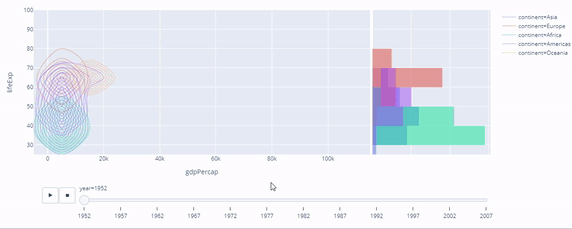
预期寿命与人均GDP的相关性
人均 GDP 与预期寿命散点图
相同的方法可用于不同类型的图,即散点图。下面的代码显示了它是如何完成的。 facet_col用于将我们的图拆分为大陆数据的子图,如下所示。
Python3
import plotly.express as px


gapminder = px.data.gapminder()
gapminder.head(15)

fig = px.scatter(
    gapminder,
    x ="gdpPercap",
    y ="lifeExp",
    animation_frame ="year",
    animation_group ="country",
    size ="pop",
    color ="continent",
    hover_name ="country",
    facet_col ="continent",
    size_max = 45,
    range_y =[25, 90]
)
fig.show()
输出:
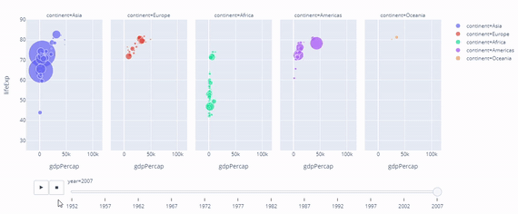
预期寿命与人均GDP的相关性
结论
因此,在本文中,我们学习了使用 Plotly Express 和Python编写以下代码。
- 动画合唱团
- 动画条形图
- 动画密度等高线图
- 动画散点图
相同的知识可以扩展到更复杂的数据集,用于生成动画可视化,并且可以与预测模型一起使用以动画化预测数据。