ReactJS UI Ant Design Popover 组件
Ant Design Library 已经预先构建了这个组件,并且它也很容易集成。 Popover 组件用作浮动卡片,通过单击或悬停在元素上弹出。我们可以在 ReactJS 中使用以下方法来使用 Ant Design Popover 组件。
弹窗道具:
- content:用于表示卡片的内容。
- title:用于表示卡片的标题。
创建 React 应用程序并安装模块:
第 1 步:使用以下命令创建一个 React 应用程序:
npx create-react-app foldername第 2 步:创建项目文件夹(即文件夹名称)后,使用以下命令移动到该文件夹:
cd foldername第 3 步:创建 ReactJS 应用程序后,安装 必需的 模块使用以下命令:
npm install antd
项目结构:它将如下所示。

项目结构
示例:现在在App.js文件中写下以下代码。在这里,App 是我们编写代码的默认组件。
App.js
import React from 'react'
import "antd/dist/antd.css";
import { Popover, Button } from 'antd';
const contentDIV = (
Greeting from GeeksforGeeks.
Work Hard!
);
export default function App() {
return (
ReactJS Ant-Design Popover Component
);
}运行应用程序的步骤:从项目的根目录使用以下命令运行应用程序:
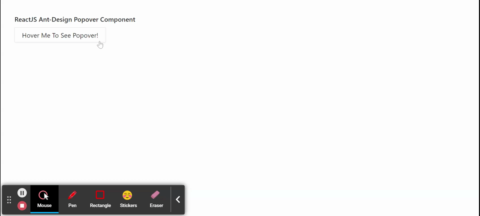
npm start输出:现在打开浏览器并转到http://localhost:3000/ ,您将看到以下输出:
参考: https://ant.design/components/popover/