Plotly 中使用 graph_objects 类的直方图
Plotly是一个Python库,用于设计图形,尤其是交互式图形。它可以绘制各种图形和图表,如直方图、条形图、箱线图、散布图等等。它主要用于数据分析和财务分析。 plotly 是一个交互式可视化库。
使用 graph_objects 类的直方图
Plotly 提供了来自 plotly.graph_objects 的更通用的 go.Histogram 类。但让我们首先了解什么是主机图。直方图有几个重要的部分,如下所述:
- 标题:标题起到描述直方图中承认的信息的作用。
- X 轴: X 轴是显示所有测量值范围的区间。
- Y 轴: Y 轴显示值在 X 轴设置的间隔内出现的次数。
- 条形:条形的高度显示值在区间内出现的次数,而条形的宽度显示所覆盖的区间。对于具有相等 bin 的直方图,所有条形的宽度应该相同。
Syntax: class plotly.graph_objects.Histogram(arg=None, alignmentgroup=None, autobinx=None, autobiny=None, bingroup=None, cumulative=None, customdata=None, customdatasrc=None, error_x=None, error_y=None, histfunc=None, histnorm=None, hoverinfo=None, hoverinfosrc=None, hoverlabel=None, hovertemplate=None, hovertemplatesrc=None, hovertext=None, hovertextsrc=None, ids=None, idssrc=None, legendgroup=None, marker=None, meta=None, metasrc=None, name=None, nbinsx=None, nbinsy=None, offsetgroup=None, opacity=None, orientation=None, selected=None, selectedpoints=None, showlegend=None, stream=None, text=None, textsrc=None, uid=None, uirevision=None, unselected=None, visible=None, x=None, xaxis=None, xbins=None, xcalendar=None, xsrc=None, y=None, yaxis=None, ybins=None, ycalendar=None, ysrc=None, **kwargs)
参数:Name Description arg dict of properties compatible with this constructor or an instance of plotly.graph_objects.Histogram alignmentgroup Set several traces linked to the same position axis or matching axes to the same alignmentgroup. This controls whether bars compute their positional range dependently or independently. autobinx Obsolete: since v1.42 each bin attribute is auto- determined separately and autobinx is not needed. However, we accept autobinx: true or false and will update xbins accordingly before deleting autobinx from the trace. autobiny Obsolete: since v1.42 each bin attribute is auto- determined separately and autobiny is not needed. However, we accept autobiny: true or false and will update ybins accordingly before deleting autobiny from the trace. bingroup Set a group of histogram traces which will have compatible bin settings. Note that traces on the same subplot and with the same “orientation” under barmode “stack”, “relative” and “group” are forced into the same bingroup, Using bingroup, traces under barmode “overlay” and on different axes (of the same axis type) can have compatible bin settings. Note that histogram and histogram2d* trace can share the same bingroup cumulative plotly.graph_objects.histogram.Cumulative instance or dict with compatible properties customdata Assigns extra data each datum. This may be useful when listening to hover, click and selection events. Note that, “scatter” traces also appends customdata items in the markers DOM elements customdatasrc Sets the source reference on Chart Studio Cloud for customdata . error_x plotly.graph_objects.histogram.ErrorX instance or dict with compatible properties error_y plotly.graph_objects.histogram.ErrorY instance or dict with compatible properties histfunc Specifies the binning function used for this histogram trace. If “count”, the histogram values are computed by counting the number of values lying inside each bin. If “sum”, “avg”, “min”, “max”, the histogram values are computed using the sum, the average, the minimum or the maximum of the values lying inside each bin respectively. histnorm Specifies the type of normalization used for this histogram trace. If “”, the span of each bar corresponds to the number of occurrences (i.e. the number of data points lying inside the bins). If “percent” / “probability”, the span of each bar corresponds to the percentage / fraction of occurrences with respect to the total number of sample points (here, the sum of all bin HEIGHTS equals 100% / 1). If “density”, the span of each bar corresponds to the number of occurrences in a bin divided by the size of the bin interval (here, the sum of all bin AREAS equals the total number of sample points). If probability density, the area of each bar corresponds to the probability that an event will fall into the corresponding bin (here, the sum of all bin AREAS equals 1). hoverinfo Determines which trace information appear on hover. If none or skip are set, no information is displayed upon hovering. But, if none is set, click and hover events are still fired. hoverinfosrc Sets the source reference on Chart Studio Cloud for hoverinfo . hoverlabel plotly.graph_objects.histogram.Hoverlabel instance or dict with compatible properties hovertemplate Template string used for rendering the information that appear on hover box. Note that this will override hoverinfo. Variables are inserted using %{variable}, for example “y: %{y}”. Numbers are formatted using d3-format’s syntax %{variable:d3-format}, for example “Price: %{y:$.2f}”. https://github.com/d3/d3-3.x-api- reference/blob/master/Formatting.md#d3_format for details on the formatting syntax. Dates are formatted using d3-time-format’s syntax %{variable|d3-time- format}, for example “Day: %{2019-01-01|%A}”. https://github.com/d3/d3-3.x-api- reference/blob/master/Time-Formatting.md#format for details on the date formatting syntax.Additionally, every attributes that can be specified per-point (the ones that are arrayOk: true) are available. variable binNumber Anything contained in tag hovertemplatesrc Sets the source reference on Chart Studio Cloud for hovertemplate hovertext same as text hovertextsrc Sets the source reference on Chart Studio Cloud for hovertext . ids Assigns id labels to each datum. These ids for object constancy of data points during animation. Should be an array of strings, not numbers or any other type. idssrc Sets the source reference on Chart Studio Cloud for ids . legendgroup Sets the legend group for this trace. Traces part of the same legend group hide/show at the same time when toggling legend items. marker plotly.graph_objects.histogram.Marker instance or dict with compatible properties meta Assigns extra meta information associated with this trace that can be used in various text attributes. Attributes such as trace name, graph, axis and colorbar title.text, annotation text rangeselector, updatemenues and sliders label text all support meta. To access the trace meta values in an attribute in the same trace, simply use %{meta[i]} where i is the index or key of the meta item in question. To access trace meta in layout attributes, use %{data[n[.meta[i]} where i is the index or key of the meta and n is the trace index. metasrc Sets the source reference on Chart Studio Cloud for meta . name Sets the trace name. The trace name appear as the legend item and on hover nbinsx Specifies the maximum number of desired bins. This value will be used in an algorithm that will decide the optimal bin size such that the histogram best visualizes the distribution of the data. Ignored if xbins.size is provided. nbinsy Specifies the maximum number of desired bins. This value will be used in an algorithm that will decide the optimal bin size such that the histogram best visualizes the distribution of the data. Ignored if ybins.size is provided. offsetgroup Set several traces linked to the same position axis or matching axes to the same offsetgroup where bars of the same position coordinate will line up. opacity Sets the opacity of the trace. orientation Sets the orientation of the bars. With “v” (“h”), the value of the each bar spans along the vertical (horizontal). selected plotly.graph_objects.histogram.Selected instance or dict with compatible properties selectedpoints Array containing integer indices of selected points. Has an effect only for traces that support selections. Note that an empty array means an empty selection where the unselected are turned on for all points, whereas, any other non-array values means no selection all where the selected and unselected styles have no effect. showlegend Determines whether or not an item corresponding to this trace is shown in the legend. stream plotly.graph_objects.histogram.Stream instance or dict with compatible properties text Sets hover text elements associated with each bar. If a single string, the same string appears over all bars. If an array of string, the items are mapped in order to the this trace’s coordinates. textsrc Sets the source reference on Chart Studio Cloud for text . uid Assign an id to this trace, Use this to provide object constancy between traces during animations and transitions. uirevision Controls persistence of some user-driven changes to the trace: constraintrange in parcoords traces, as well as some editable: true modifications such as name and colorbar.title. Defaults to layout.uirevision. Note that other user-driven trace attribute changes are controlled by layout attributes: trace.visible is controlled by layout.legend.uirevision, selectedpoints is controlled by layout.selectionrevision, and colorbar.(x|y) (accessible with config: {editable: true}) is controlled by layout.editrevision. Trace changes are tracked by uid, which only falls back on trace index if no uid is provided. So if your app can add/remove traces before the end of the data array, such that the same trace has a different index, you can still preserve user-driven changes if you give each trace a uid that stays with it as it moves. unselected plotly.graph_objects.histogram.Unselected instance or dict with compatible properties visible Determines whether or not this trace is visible. If “legendonly”, the trace is not drawn, but can appear as a legend item (provided that the legend itself is visible). x Sets the sample data to be binned on the x axis. xaxis Sets a reference between this trace’s x coordinates and a 2D cartesian x axis. If “x” (the default value), the x coordinates refer to layout.xaxis. If “x2”, the x coordinates refer to layout.xaxis2, and so on. xbins plotly.graph_objects.histogram.XBins instance or dict with compatible properties xcalender Sets the calendar system to use with x date data. xsrc Sets the source reference on Chart Studio Cloud for x y Sets the sample data to be binned on the y axis. yaxis Sets a reference between this trace’s y coordinates and a 2D cartesian y axis. If “y” (the default value), the y coordinates refer to layout.yaxis. If “y2”, the y coordinates refer to layout.yaxis2, and so on. ybins plotly.graph_objects.histogram.YBins instance or dict with compatible properties ycalender Sets the calendar system to use with y date data. ysrc Sets the source reference on Chart Studio Cloud for y .
例子:
Python3
import plotly.express as px
import plotly.graph_objects as go
df = px.data.iris()
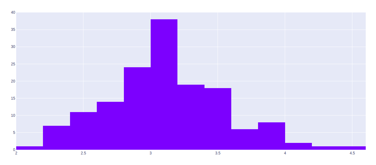
fig = go.Figure(data=[go.Histogram(x=df['sepal_width'])])
fig.show()Python3
import plotly.express as px
import plotly.graph_objects as go

df = px.data.iris()

fig = go.Figure(data=[go.Histogram(y=df['sepal_width'])])
fig.show()
Python3
import plotly.express as px
import plotly.graph_objects as go

df = px.data.iris()

fig = go.Figure()
fig.add_trace(go.Histogram(x=df['sepal_width']))
fig.add_trace(go.Histogram(x=df['species_id']))

fig.update_layout(barmode='stack')
fig.show()
输出:
水平直方图
水平直方图是一种直方图,其中数据在图中的条形图中水平显示。数据根据它们的值和 bin 的范围被分组到类别或 bin 中。应使用 Y 参数而不是 x 参数来制作水平直方图。
例子:
Python3
import plotly.express as px
import plotly.graph_objects as go

df = px.data.iris()

fig = go.Figure(data=[go.Histogram(y=df['sepal_width'])])
fig.show()
输出:

堆叠直方图
堆叠直方图是一种图形或图形表示,其中数据以单个条形表示,每种不同的颜色。该条可以是水平的或垂直的,具体取决于组件。
例子:
Python3
import plotly.express as px
import plotly.graph_objects as go

df = px.data.iris()

fig = go.Figure()
fig.add_trace(go.Histogram(x=df['sepal_width']))
fig.add_trace(go.Histogram(x=df['species_id']))

fig.update_layout(barmode='stack')
fig.show()
输出:
