在 R 中使用 ggplot2 修改轴、图例和绘图标签
在本文中,我们将了解如何使用 R 编程语言中的 ggplot2 条形图修改轴标签、图例和绘图标签。
为了创建一个简单的条形图,我们将使用函数geom_bar()。
Syntax: geom_bar(stat, fill, color, width)
Parameters :
stat : Set the stat parameter to identify the mode.
fill : Represents color inside the bars.
color : Represents color of outlines of the bars.
width : Represents width of the bars.
使用中的数据集:
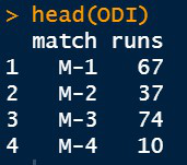
让我们首先将图形可视化,以便更改显而易见。
例子:
R
# Inserting data
ODI <- data.frame(match=c("M-1","M-2","M-3","M-4"),
                   runs=c(67,37,74,10))
head(ODI)

library(ggplot2)

# Default axis labels in ggplot2 bar plot
perf <-ggplot(data=ODI, aes(x=match, y=runs,fill=match))+
  geom_bar(stat="identity")

perf
R
library(ggplot2)

# Inserting data
ODI <- data.frame(match=c("M-1","M-2","M-3","M-4"),
                   runs=c(67,37,74,10))

# Default axis labels in ggplot2
# bar plot
perf <-ggplot(data=ODI, aes(x=match, y=runs,fill=match))+
  geom_bar(stat="identity")
perf

# Manually adding axis labels and
# Plot Label
ggp<-perf+labs(x="Matches",y="Runs Scored",
               title="Runs scored by Virat Kohli in ODI matches")
ggp
R
library(ggplot2)

# Inserting data
ODI <- data.frame(match=c("M-1","M-2","M-3","M-4"),
                   runs=c(67,37,74,10))

# Default axis labels in ggplot2 bar plot
perf <-ggplot(data=ODI, aes(x=match, y=runs,fill=match))+
  geom_bar(stat="identity")
perf

# Manually adding axis labels and Plot Label
ggp<-perf+labs(x="Matches",y="Runs Scored",
               title="Runs scored by Virat Kohli in ODI matches")
ggp

# Subtitle and Caption
ggp+labs(subtitle="Performance",caption="GeeksforGeeks Trophy")
R
library(ggplot2)

# Inserting data
ODI <- data.frame(match=c("M-1","M-2","M-3","M-4"),
                   runs=c(67,37,74,10))

# Default axis labels in ggplot2 bar plot
perf <-ggplot(data=ODI, aes(x=match, y=runs,fill=match))+
  geom_bar(stat="identity")
perf

# Manually adding axis labels and Plot Label
ggp<-perf+labs(x="Matches",y="Runs Scored",
               title="Runs scored by Virat Kohli in ODI matches")
ggp

# Moving axis label to left
ggp + theme(
  axis.title.x = element_text(hjust=0),
  axis.title.y = element_text(hjust=0)
  )

# Moving axis label in middle
ggp + theme(
  axis.title.x = element_text(hjust=0.5),
  axis.title.y = element_text(hjust=0.5)
)

# Moving axis label to right
ggp + theme(
  axis.title.x = element_text(hjust=1),
  axis.title.y = element_text(hjust=1)
)
R
library(ggplot2)

# Inserting data
ODI <- data.frame(match=c("M-1","M-2","M-3","M-4"),
                   runs=c(67,37,74,10))

# Default axis labels in ggplot2 bar plot
perf <-ggplot(data=ODI, aes(x=match, y=runs,fill=match))+
  geom_bar(stat="identity")
perf

# Manually adding axis labels and Plot Label
ggp<-perf+labs(x="Matches",y="Runs Scored",
               title="Runs scored by Virat Kohli in ODI matches")

# Plot title, axis labels format
ggp + theme(plot.title = element_text(
  colour="#006000", size=14,face="bold"),

            axis.title.x = element_text(
              colour="Purple",size=10,face="bold.italic"),

            axis.title.y = element_text(
              colour="DarkBlue",size=10,face="bold.italic")
           )
R
library(ggplot2)

# Inserting data
ODI <- data.frame(match=c("M-1","M-2","M-3","M-4"),
                   runs=c(67,37,74,10))

# Default axis labels in ggplot2 bar plot
perf <-ggplot(data=ODI, aes(x=match, y=runs,fill=match))+
  geom_bar(stat="identity")
perf

# Manually adding axis labels and Plot Label
ggp<-perf+labs(x="Matches",y="Runs Scored",
               title="Runs scored by Virat Kohli in ODI matches")

# Remove chart title and axis label
ggp + theme(plot.title = element_blank(),
            axis.title.x = element_blank(),
            axis.title.y = element_blank()
            )
R
library(ggplot2)

# Inserting data
ODI <- data.frame(match=c("M-1","M-2","M-3","M-4"),
                   runs=c(67,37,74,10))

# Default axis labels in ggplot2 bar plot
perf <-ggplot(data=ODI, aes(x=match, y=runs,fill=match))+
  geom_bar(stat="identity")
perf

# Manually adding axis labels and Plot Label
ggp<-perf+labs(x="Matches",y="Runs Scored",
               title="Runs scored by Virat Kohli in ODI matches")

# Move legend to top position of the plot
ggp + theme(legend.position="top")
R
library(ggplot2)

# Inserting data
ODI <- data.frame(match=c("M-1","M-2","M-3","M-4"),
                   runs=c(67,37,74,10))

# Default axis labels in ggplot2 bar plot
perf <-ggplot(data=ODI, aes(x=match, y=runs,fill=match))+
  geom_bar(stat="identity")
perf

# Manually adding axis labels and Plot Label
ggp<-perf+labs(x="Matches",y="Runs Scored",
               title="Runs scored by Virat Kohli in ODI matches")

# Move legend to bottom position of the plot
ggp + theme(legend.position="bottom")
输出:

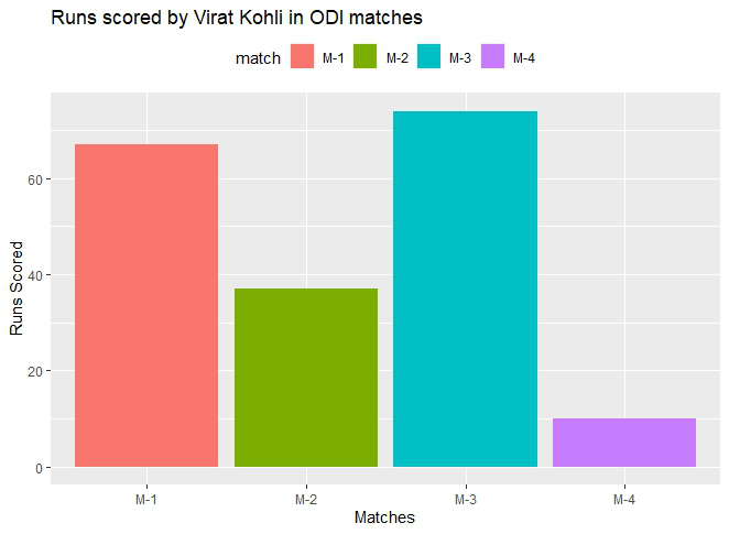
在图中添加轴标签和主标题
默认情况下,R 将使用数据框中提供的变量作为轴的标签。我们可以轻松修改它们并改变它们的外观。用于更改轴标签的功能是:
- xlab( ) :对于水平轴。
- ylab( ) :对于垂直轴。
- labs( ) :同时用于两个轴。
- element_text() :这个函数的参数是:
句法:
element_text( family, face, color, size, hjust, vjust, angle, margin)
- element_blank( ):使标签为 NULL 并将它们从图中删除。
参数hjust (水平调整)或vjust (垂直调整)用于移动轴标签。它们采用范围 [0,1] 中的数字,其中:
hjust = 0 // Depicts left most corner of the axis
hjust = 0.5 // Depicts middle of the axis
hjust = 1 // Depicts right most corner of the axis
使用的关键字是:
- 标题:添加绘图标签。
- 副标题:在情节中添加副标题。
- caption : 在情节中添加标题。
- axis.title.x :对于水平轴。
- axis.title.y :用于垂直轴。
例子:
电阻
library(ggplot2)

# Inserting data
ODI <- data.frame(match=c("M-1","M-2","M-3","M-4"),
                   runs=c(67,37,74,10))

# Default axis labels in ggplot2
# bar plot
perf <-ggplot(data=ODI, aes(x=match, y=runs,fill=match))+
  geom_bar(stat="identity")
perf

# Manually adding axis labels and
# Plot Label
ggp<-perf+labs(x="Matches",y="Runs Scored",
               title="Runs scored by Virat Kohli in ODI matches")
ggp
输出:

也可以使用 labs()函数将副标题包含在主标题中,并传递带有所需副标题的副标题参数。
例子:
电阻
library(ggplot2)

# Inserting data
ODI <- data.frame(match=c("M-1","M-2","M-3","M-4"),
                   runs=c(67,37,74,10))

# Default axis labels in ggplot2 bar plot
perf <-ggplot(data=ODI, aes(x=match, y=runs,fill=match))+
  geom_bar(stat="identity")
perf

# Manually adding axis labels and Plot Label
ggp<-perf+labs(x="Matches",y="Runs Scored",
               title="Runs scored by Virat Kohli in ODI matches")
ggp

# Subtitle and Caption
ggp+labs(subtitle="Performance",caption="GeeksforGeeks Trophy")
输出:

根据要求设置移动轴标签 hjust 参数。
例子:
电阻
library(ggplot2)

# Inserting data
ODI <- data.frame(match=c("M-1","M-2","M-3","M-4"),
                   runs=c(67,37,74,10))

# Default axis labels in ggplot2 bar plot
perf <-ggplot(data=ODI, aes(x=match, y=runs,fill=match))+
  geom_bar(stat="identity")
perf

# Manually adding axis labels and Plot Label
ggp<-perf+labs(x="Matches",y="Runs Scored",
               title="Runs scored by Virat Kohli in ODI matches")
ggp

# Moving axis label to left
ggp + theme(
  axis.title.x = element_text(hjust=0),
  axis.title.y = element_text(hjust=0)
  )

# Moving axis label in middle
ggp + theme(
  axis.title.x = element_text(hjust=0.5),
  axis.title.y = element_text(hjust=0.5)
)

# Moving axis label to right
ggp + theme(
  axis.title.x = element_text(hjust=1),
  axis.title.y = element_text(hjust=1)
)
输出:


轴标签的格式化外观和绘图的主标题
可以更改轴标签和主标题以反映所需的外观。为此 element_text()函数传递了所需的属性。
例子:
电阻
library(ggplot2)

# Inserting data
ODI <- data.frame(match=c("M-1","M-2","M-3","M-4"),
                   runs=c(67,37,74,10))

# Default axis labels in ggplot2 bar plot
perf <-ggplot(data=ODI, aes(x=match, y=runs,fill=match))+
  geom_bar(stat="identity")
perf

# Manually adding axis labels and Plot Label
ggp<-perf+labs(x="Matches",y="Runs Scored",
               title="Runs scored by Virat Kohli in ODI matches")

# Plot title, axis labels format
ggp + theme(plot.title = element_text(
  colour="#006000", size=14,face="bold"),

            axis.title.x = element_text(
              colour="Purple",size=10,face="bold.italic"),

            axis.title.y = element_text(
              colour="DarkBlue",size=10,face="bold.italic")
           )
输出:

删除轴标签并绘制标题
对于这个 theme()函数是根据需要修改的绘图部分来调用的。对于这些引用,不带任何参数传递 element_blank()。
例子:
电阻
library(ggplot2)

# Inserting data
ODI <- data.frame(match=c("M-1","M-2","M-3","M-4"),
                   runs=c(67,37,74,10))

# Default axis labels in ggplot2 bar plot
perf <-ggplot(data=ODI, aes(x=match, y=runs,fill=match))+
  geom_bar(stat="identity")
perf

# Manually adding axis labels and Plot Label
ggp<-perf+labs(x="Matches",y="Runs Scored",
               title="Runs scored by Virat Kohli in ODI matches")

# Remove chart title and axis label
ggp + theme(plot.title = element_blank(),
            axis.title.x = element_blank(),
            axis.title.y = element_blank()
            )
输出:

改变图例的位置
要更改图例的位置,以legend.position 作为参数调用theme()函数,并向此参数传递所需的位置。
Syntax:
theme( legend.position = “Pos”)
Parameter:
Pos : Left, Right, Top, Bottom.
例子:
电阻
library(ggplot2)

# Inserting data
ODI <- data.frame(match=c("M-1","M-2","M-3","M-4"),
                   runs=c(67,37,74,10))

# Default axis labels in ggplot2 bar plot
perf <-ggplot(data=ODI, aes(x=match, y=runs,fill=match))+
  geom_bar(stat="identity")
perf

# Manually adding axis labels and Plot Label
ggp<-perf+labs(x="Matches",y="Runs Scored",
               title="Runs scored by Virat Kohli in ODI matches")

# Move legend to top position of the plot
ggp + theme(legend.position="top")
输出:
例子:
电阻
library(ggplot2)

# Inserting data
ODI <- data.frame(match=c("M-1","M-2","M-3","M-4"),
                   runs=c(67,37,74,10))

# Default axis labels in ggplot2 bar plot
perf <-ggplot(data=ODI, aes(x=match, y=runs,fill=match))+
  geom_bar(stat="identity")
perf

# Manually adding axis labels and Plot Label
ggp<-perf+labs(x="Matches",y="Runs Scored",
               title="Runs scored by Virat Kohli in ODI matches")

# Move legend to bottom position of the plot
ggp + theme(legend.position="bottom")
输出:
