📌 相关文章
- Ionic-Javascript操作表
- Ionic-Javascript操作表(1)
- ionic (1)
- ionic 4与ionic 3(1)
- ionic 段
- ionic 段(1)
- ionic 4与ionic 3
- ionic 列表
- ionic 列表(1)
- ionic - 任何代码示例
- Ionic键和Ionic化合物
- Ionic键和Ionic化合物(1)
- ionic安装(1)
- ionic安装
- ionic - Shell-Bash (1)
- ionic 输入
- ionic 输入(1)
- ionic 按钮
- ionic 按钮(1)
- ionic 选择(1)
- ionic 选择
- ionic 新项目 (1)
- ionic 颜色(1)
- ionic 颜色
- ionic 范围(1)
- ionic 范围
- ionic - Shell-Bash 代码示例
- C# 操作 - C# (1)
- ionic 加载(1)
📜 ionic 操作表
📅 最后修改于: 2021-01-03 04:46:24 🧑 作者: Mango
离子动作片
离子组件由高级构建块制成,这被称为组件。这些组件使我们能够快速构建应用程序的界面。 Ionic Framework包含许多内置组件,这些组件包括按钮,模式,弹出窗口,列表,卡片等。在这里,我们将学习该组件的外观以及如何使用它们。
“动作表”是一个对话框,允许我们从一组选项中选择确认或取消动作。它始终显示在页面上任何其他组件的顶部,并且必须由用户手动将其关闭才能与该应用进行交互。触发操作表时,页面的其余部分会变暗,以使操作表的选项更加集中。
有时,我们使用操作表代替菜单。但是,不应将其用于导航。
通过下面的示例,我们可以了解操作表组件的工作方式。
home.page.ts
这是Ionic应用程序的主页,负责用户界面。在这里,我们正在创建一个菜单,其中包含破坏性元素,存档元素和取消元素。
import { Component } from '@angular/core';
import {ActionSheetController } from '@ionic/angular';

@Component({
  selector: 'app-home',
  templateUrl: 'home.page.html',
  styleUrls: ['home.page.scss'],
})
export class HomePage {
  constructor(
    public actionsheetCtrl: ActionSheetController
  ) { }

  async openMenu() {
    const actionSheet = await this.actionsheetCtrl.create({
      header: 'Modify your album',
      buttons: [
        {
          text: 'Destructive',
          role: 'destructive',
          handler: () => {
            console.log('Destructive clicked');
          }
        },{
          text: 'Archive',
          handler: () => {
            console.log('Archive clicked');
          }
        }, {
          text: 'Cancel',
          role: 'cancel',
          handler: () => {
            console.log('Cancel clicked');
          }
        }
      ]
    });
    await actionSheet.present();
  }
}
home.page.html
该HTML页面负责设计(外观)您的主页。它还包含了HTML元素,如按钮元素的动作。
Action Sheets
home.page.scss
这是CSS文件,其中包含HTML元素上的其他样式。
.action-sheet-home-page {
    .ion-md-share {
      color: #ED4248;
    }
    .ion-md-arrow-dropright-circle {
      color: #508AE4;
    }
    .ion-md-heart-outline {
      color: #31D55F;
    }
    .action-sheet-cancel ion-icon,
    .action-sheet-destructive ion-icon {
      color: #757575;
    }
  }
输出量
现在,通过以下命令在终端上执行该应用程序。
$ ionic serve
它的输出如下屏幕所示。现在,如果您使用IDE,并且修改或更改了代码中的任何内容,则在修改后,一旦保存文件,浏览器就会自动重新加载您的应用程序。

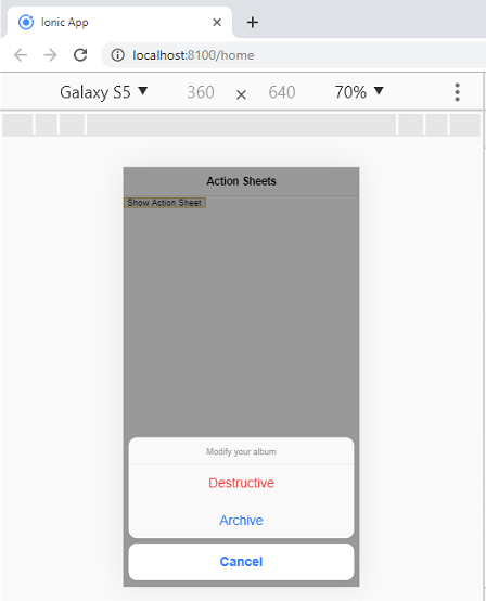
现在,单击“显示操作表”按钮,以下输出将出现在屏幕上。触发操作表后,页面的其余部分将变暗,以使操作表的选项更加集中。
$ ionicActionSheet.show()方法还包含几个有用的参数,我们可以在下表中看到它们。
| Properties | Type | Descriptions |
|---|---|---|
| buttons | Object | It creates the button object with a text field. |
| titleText | String | It sets the title of the Action Sheet. |
| cancelText | String | It sets the text for cancel button. |
| destructiveText | String | It sets the text for destructive button. |
| cancel | Function | It is called when the cancel button, backdrop or hardware back button is pressed. |
| buttonClicked | Function | It is called when one of the buttons is tapped. Here, the index is used for keeping track of which button is tapped. If it returns true, the Action Sheet will be closed. |
| destructiveButtonClicked | Function | It is called when the destructive button is clicked. If it returns true, the Action Sheet will be closed. |
| cancelOnStateChange | boolean | It is by default true, which cancel the Action Sheet when navigation state is changed. |