Angular PrimeNG 面板组件
Angular PrimeNG 是一个开源框架,具有丰富的原生 Angular UI 组件集,可用于出色的样式,并且该框架用于非常轻松地制作响应式网站。在本文中,我们将了解如何在 Angular PrimeNG 中使用 Panel 组件。我们还将了解将在代码中使用的属性、事件和样式以及它们的语法。
面板组件:它 允许我们制作一个包含标题和与该标题相关联的一些内容的元素。
特性:
- header:面板的标题文本。它是字符串数据类型,默认值为空。
- toggleable:定义面板的内容是否可以展开和折叠。它是布尔数据类型,默认值为false。
- 折叠:它定义了面板内容的初始状态。它是布尔数据类型,默认值为false。
- style:是组件的内联样式。它是字符串数据类型,默认值为空。
- styleClass:组件的样式类。它是字符串数据类型,默认值为空。
- expandIcon:它是切换按钮的展开图标。它是字符串数据类型,默认值为 pi pi-plus。
- collapseIcon:它是切换按钮的折叠图标。它是字符串数据类型,默认值为 pi pi-minus。
- showHeader:它指定是否不能显示面板的标题。它是布尔数据类型,默认值为true。
- transitionOptions:动画的过渡选项。它是字符串数据类型,默认值为 400ms 三次贝塞尔曲线(0.86, 0, 0.07, 1)。
- 切换器:它指定切换器元素是否切换面板内容。它是字符串数据类型,默认值是一个图标。
事件:
- onBeforeToggle:它是在内容切换之前触发的回调。
- onAfterToggle:它是在内容切换后触发的回调。
造型:
- p-panel :它是容器元素。
- p-panel-titlebar:它是标题部分。
- p-panel-title:面板的标题文本。
- p-panel-titlebar-toggler:它是切换图标。
- p-panel-content:面板的内容。
创建 Angular 应用程序和模块安装:
- 第 1 步:使用以下命令创建一个 Angular 应用程序。
ng new appname- 第 2 步:创建项目文件夹(即 appname)后,使用以下命令移动到该文件夹。
cd appname- 第 3 步:在给定目录中安装 PrimeNG。
npm install primeng --save
npm install primeicons --save项目结构:它将如下所示:

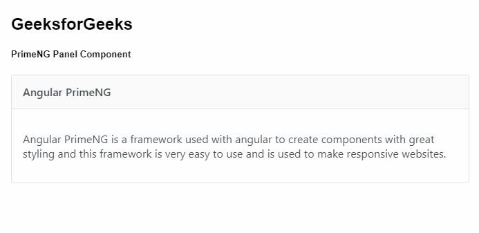
示例 1:这是说明如何使用 Panel 组件的基本示例。
app.component.html
GeeksforGeeks
PrimeNG Panel Component


      Angular PrimeNG is a framework used
      with angular to create components
      with great styling and this framework
      is very easy to use and is used to
      make responsive websites.
app.component.ts
import { Component } from '@angular/core';

@Component({
  selector: 'my-app',
  templateUrl: './app.component.html',
  styleUrls: ['./app.component.scss']
})
export class AppComponent {}
app.module.ts
import { NgModule } from "@angular/core";
import { BrowserModule } from "@angular/platform-browser";
import { BrowserAnimationsModule }
    from "@angular/platform-browser/animations";

import { AppComponent } from "./app.component";
import { PanelModule } from "primeng/panel";

@NgModule({
  imports: [BrowserModule,
              BrowserAnimationsModule,
            PanelModule],
  declarations: [AppComponent],
  bootstrap: [AppComponent],
})
export class AppModule {}
app.component.html
GeeksforGeeks
PrimeNG Panel Component


    Angular PrimeNG is a framework used
    with angular to create components with
    great styling and this framework is
    very easy to use and is used to make
    responsive websites.
app.component.ts
import { Component } from '@angular/core';

@Component({
  selector: 'my-app',
  templateUrl: './app.component.html',
  styleUrls: ['./app.component.scss']
})
export class AppComponent {}
app.module.ts
import { NgModule } from "@angular/core";
import { BrowserModule } from "@angular/platform-browser";
import { BrowserAnimationsModule }
    from "@angular/platform-browser/animations";

import { AppComponent } from "./app.component";
import { PanelModule } from "primeng/panel";

@NgModule({
  imports: [BrowserModule,
              BrowserAnimationsModule,
            PanelModule],
  declarations: [AppComponent],
  bootstrap: [AppComponent],
})
export class AppModule {}
输出:
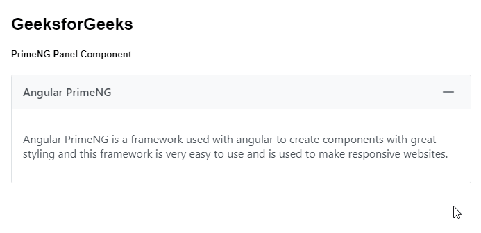
示例 2:在此示例中,我们将了解如何使用 Panel 组件中的可切换属性。
app.component.html
GeeksforGeeks
PrimeNG Panel Component


    Angular PrimeNG is a framework used
    with angular to create components with
    great styling and this framework is
    very easy to use and is used to make
    responsive websites.
app.component.ts
import { Component } from '@angular/core';

@Component({
  selector: 'my-app',
  templateUrl: './app.component.html',
  styleUrls: ['./app.component.scss']
})
export class AppComponent {}
app.module.ts
import { NgModule } from "@angular/core";
import { BrowserModule } from "@angular/platform-browser";
import { BrowserAnimationsModule }
    from "@angular/platform-browser/animations";

import { AppComponent } from "./app.component";
import { PanelModule } from "primeng/panel";

@NgModule({
  imports: [BrowserModule,
              BrowserAnimationsModule,
            PanelModule],
  declarations: [AppComponent],
  bootstrap: [AppComponent],
})
export class AppModule {}
输出:
参考: https://primefaces.org/primeng/showcase/#/panel