Angular PrimeNG 按钮组件
Angular PrimeNG 是一个开源框架,具有丰富的原生 Angular UI 组件集,可用于出色的样式,并且该框架用于非常轻松地制作响应式网站。在本文中,我们将了解如何在 Angular PrimeNG 中使用 Button 组件。我们还将了解将在代码中使用的属性、样式以及它们的语法。
按钮组件: It 用于制作一个标准按钮,指示可能的用户操作。
pButton 的属性:
- label:是按钮的文本。它是字符串数据类型,默认值为空。
- 图标:是图标的名称。它是字符串数据类型,默认值为空。
- iconPos:指定图标的位置,有效值为“left”和“right”。它是字符串类型,保留默认值。
- loading:指定按钮是否处于加载状态。它是布尔数据类型,默认值为 false
- loadingIcon:加载状态下显示的图标。它是字符串类型,默认值为 pi pi-spinner pi-spin。
p按钮的属性:
- type :它指定按钮的类型。它是字符串类型,默认值为空。
- label :它指定按钮的文本。它是字符串类型,默认值为空。
- icon :它指定图标的名称。它是字符串类型,默认值为空。
- iconPos :指定图标的位置,有效值为“left”和“right”。它是字符串类型,保留默认值。
- 徽章:它指定徽章值。它是字符串类型,默认值为空。
- badgeClass :它指定徽章样式类。它是字符串类型,默认值为空。
- loading :指定按钮是否处于加载状态。它是布尔类型,默认值为 false。
- loadingIcon :它指定在加载状态下显示的图标。它是字符串类型,默认值为 pi pi-spinner pi-spin。
- disabled : 它指定组件应该被禁用。它是布尔类型,默认值为 false。
- style :它指定元素的内联样式。它是字符串类型,默认值为空。
- styleClass :它指定元素的样式类。它是字符串类型,默认值为空。
- onClick :用于在单击按钮时回调执行。它属于事件类型,默认值为空。
- onFocus :用于在按钮获得焦点时回调执行。它属于事件类型,默认值为空。
- onBlur :用于在按钮失去焦点时回调执行。它属于事件类型,默认值为空。
造型:
- p-button:它是按钮元素。
- p-button-icon:图标元素。
- p-button-label:是按钮的标签元素。
创建 Angular 应用程序和模块安装:
- 第 1 步:使用以下命令创建一个 Angular 应用程序。
ng new appname- 第 2 步:创建项目文件夹(即 appname)后,使用以下命令移动到该文件夹。
cd appname- 第 3 步:在给定目录中安装 PrimeNG。
npm install primeng --save
npm install primeicons --save项目结构:它将如下所示:

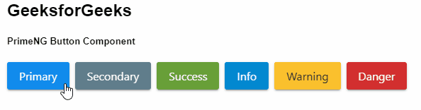
示例 1:这是说明如何使用 Button 组件的基本示例。
app.component.html
GeeksforGeeks
PrimeNG Button Component
app.component.ts
import { Component } from '@angular/core';

@Component({
  selector: 'my-app',
  templateUrl: './app.component.html',
  styleUrls: ['./app.component.scss']
})
export class AppComponent {}
app.module.ts
import { NgModule } from "@angular/core";
import { BrowserModule } from "@angular/platform-browser";
import { BrowserAnimationsModule }
    from "@angular/platform-browser/animations";

import { AppComponent } from "./app.component";
import { ButtonModule } from "primeng/button";
import { RippleModule } from "primeng/ripple";

@NgModule({
  imports: [BrowserModule,
              BrowserAnimationsModule,
            ButtonModule, RippleModule],
  declarations: [AppComponent],
  bootstrap: [AppComponent],
})
export class AppModule {}
app.component.html
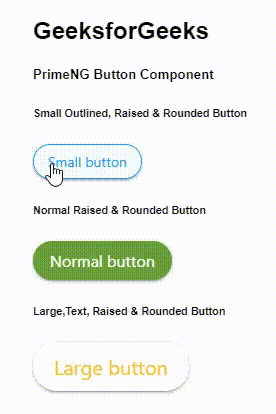
GeeksforGeeks
PrimeNG Button Component
Small Outlined, Raised & Rounded Button


Normal Raised & Rounded Button


Large,Text, Raised & Rounded Button
app.component.ts
import { Component } from "@angular/core";

@Component({
  selector: "my-app",
  templateUrl: "./app.component.html",
  styleUrls: ["./app.component.scss"],
})
export class AppComponent {}
app.module.ts
import { NgModule } from "@angular/core";
import { BrowserModule } from "@angular/platform-browser";
import { BrowserAnimationsModule }
        from "@angular/platform-browser/animations";

import { AppComponent } from "./app.component";
import { ButtonModule } from "primeng/button";
import { RippleModule } from "primeng/ripple";

@NgModule({
  imports: [BrowserModule,
              BrowserAnimationsModule,
            ButtonModule, RippleModule],
  declarations: [AppComponent],
  bootstrap: [AppComponent],
})
export class AppModule {}
app.component.ts
import { Component } from '@angular/core';

@Component({
  selector: 'my-app',
  templateUrl: './app.component.html',
  styleUrls: ['./app.component.scss']
})
export class AppComponent {}
app.module.ts
import { NgModule } from "@angular/core";
import { BrowserModule } from "@angular/platform-browser";
import { BrowserAnimationsModule }
    from "@angular/platform-browser/animations";

import { AppComponent } from "./app.component";
import { ButtonModule } from "primeng/button";
import { RippleModule } from "primeng/ripple";

@NgModule({
  imports: [BrowserModule,
              BrowserAnimationsModule,
            ButtonModule, RippleModule],
  declarations: [AppComponent],
  bootstrap: [AppComponent],
})
export class AppModule {}
输出:
示例 2:在本示例中,我们将了解如何使用 Button 组件中的各种可用类属性。
app.component.html
GeeksforGeeks
PrimeNG Button Component
Small Outlined, Raised & Rounded Button


Normal Raised & Rounded Button


Large,Text, Raised & Rounded Button
app.component.ts
import { Component } from "@angular/core";

@Component({
  selector: "my-app",
  templateUrl: "./app.component.html",
  styleUrls: ["./app.component.scss"],
})
export class AppComponent {}
app.module.ts
import { NgModule } from "@angular/core";
import { BrowserModule } from "@angular/platform-browser";
import { BrowserAnimationsModule }
        from "@angular/platform-browser/animations";

import { AppComponent } from "./app.component";
import { ButtonModule } from "primeng/button";
import { RippleModule } from "primeng/ripple";

@NgModule({
  imports: [BrowserModule,
              BrowserAnimationsModule,
            ButtonModule, RippleModule],
  declarations: [AppComponent],
  bootstrap: [AppComponent],
})
export class AppModule {}
输出:
参考: https://primefaces.org/primeng/showcase/#/button