Angular PrimeNG PanelMenu 组件
Angular PrimeNG 是一个开源框架,具有丰富的原生 Angular UI 组件集,可用于出色的样式,并且该框架用于非常轻松地制作响应式网站。在本文中,我们将了解如何在 Angular PrimeNG 中使用 PanelMenu 组件。我们还将了解将在代码中使用的属性、样式以及它们的语法。
PanelMenu 组件:用于制作面板形式的菜单。它可以被认为是手风琴和树组件的组合
特性:
- 模型:它是一个菜单项数组。它接受数组数据类型作为输入,默认值为空。
- style:用于设置组件的内联样式。它是字符串数据类型,默认值为空。
- styleClass:用于设置组件的样式类。它是字符串数据类型,默认值为空。
- 多个:用于指定是否可以同时激活多个选项卡。它是布尔数据类型,默认值为 true。
- transitionOptions:用于设置动画的过渡选项。它是字符串数据类型,默认值为 400ms 三次贝塞尔曲线(0.86, 0, 0.07, 1)。
造型:
- p-panelmenu:它是一个容器元素。
- p-panelmenu-header:它是根子菜单的折叠式标题。
- p-panelmenu-content:根子菜单的手风琴内容。
- p-menu-list:它是一个元素列表。
- p-menuitem:它是一个元素菜单项。
- p-menuitem-text:菜单项的标签。
- p-menuitem-icon:它是一个菜单项的图标。
- p-panelmenu-icon:它是手风琴标题的箭头图标。
创建 Angular 应用程序和模块安装:
- 第 1 步:使用以下命令创建一个 Angular 应用程序。
ng new appname- 第 2 步:创建项目文件夹(即 appname)后,使用以下命令移动到该文件夹。
cd appname- 第 3 步:在给定目录中安装 PrimeNG。
npm install primeng --save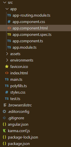
npm install primeicons --save项目结构:安装完成后如下图所示:
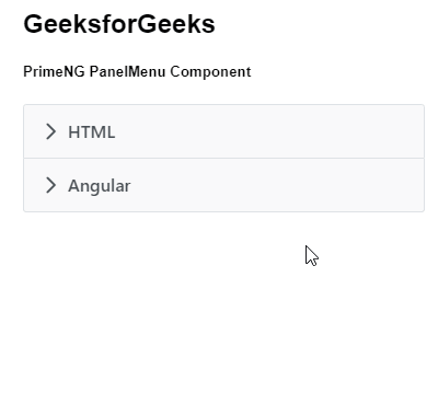
示例 1:这是说明如何使用 PanelMenu 组件的基本示例。
app.component.html
GeeksforGeeks
PrimeNG PanelMenu Component
app.module.ts
import { NgModule } from '@angular/core';
import { BrowserModule } from '@angular/platform-browser';
import { BrowserAnimationsModule }
    from '@angular/platform-browser/animations';

import { AppComponent } from './app.component';
import { PanelMenuModule } from 'primeng/panelmenu';

@NgModule({
  imports: [BrowserModule,
              BrowserAnimationsModule,
            PanelMenuModule],
  declarations: [AppComponent],
  bootstrap: [AppComponent]
})
export class AppModule {}
app.component.ts
import { Component } from '@angular/core';
import { MenuItem } from 'primeng/api';

@Component({
  selector: 'my-app',
  templateUrl: './app.component.html'
})
export class AppComponent {
  gfg: MenuItem[];

  ngOnInit() {
    this.gfg = [
      {
        label: 'HTML',
        items: [
          {
            label: 'HTML 1'
          },
          {
            label: 'HTML 2'
          }
        ]
      },
      {
        label: 'Angular',

        items: [
          {
            label: 'Angular 1'
          },
          {
            label: 'Angular 2'
          }
        ]
      }
    ];
  }
}
输出:
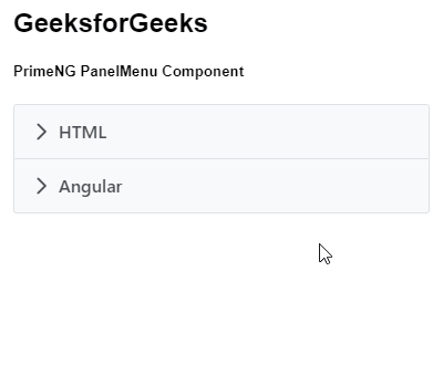
示例 2:在这个示例中,我们将了解如何在 panelmenu 组件中使用多个属性。
app.component.html
GeeksforGeeks
PrimeNG PanelMenu Component
app.module.ts
import { NgModule } from '@angular/core';
import { BrowserModule } from '@angular/platform-browser';
import { BrowserAnimationsModule }
    from '@angular/platform-browser/animations';

import { AppComponent } from './app.component';
import { PanelMenuModule } from 'primeng/panelmenu';

@NgModule({
  imports: [BrowserModule,
              BrowserAnimationsModule,
            PanelMenuModule],
  declarations: [AppComponent],
  bootstrap: [AppComponent]
})
export class AppModule {}
app.component.ts
import { Component } from '@angular/core';
import { MenuItem } from 'primeng/api';

@Component({
  selector: 'my-app',
  templateUrl: './app.component.html'
})
export class AppComponent {
  gfg: MenuItem[];

  ngOnInit() {
    this.gfg = [
      {
        label: 'HTML',
        items: [
          {
            label: 'HTML 1'
          },
          {
            label: 'HTML 2'
          }
        ]
      },
      {
        label: 'Angular',

        items: [
          {
            label: 'Angular 1'
          },
          {
            label: 'Angular 2'
          }
        ]
      }
    ];
  }
}
输出:
参考: https://primefaces.org/primeng/showcase/#/panelmenu