Angular PrimeNG BlockUI 组件
Angular PrimeNG 是一个开源框架,具有丰富的原生 Angular UI 组件集,可用于出色的样式,并且该框架用于非常轻松地制作响应式网站。在本文中,我们将了解如何在 Angular PrimeNG 中使用 BlockUI 组件。
BlockUI 组件:用于阻塞组件或整个页面。
特性:
- 阻塞:用于控制阻塞状态。它是布尔数据类型,默认值为false。
- target :用于定义本地 ng-template 变量的名称,引用另一个组件。它是字符串数据类型,默认值文件。
- baseZIndex :用于定义要在分层中使用的基本 z-Index 值。它是数字数据类型,默认值为 0。
- autoZIndex :用于是否自动管理分层。它是布尔数据类型,默认值为true。
- styleClass :用于定义组件的样式类。它是字符串数据类型,默认值为false。
造型:
- p-blockui:它是掩蔽元素。
- p-blockui-document:全屏模式下的遮罩元素。
创建 Angular 应用程序和模块安装:
第 1 步:使用以下命令创建一个 Angular 应用程序。
ng new appname第 2 步:创建项目文件夹(即 appname)后,使用以下命令移动到该文件夹。
cd appname第 3 步:在给定目录中安装 PrimeNG。
npm install primeng --save
npm install primeicons --save
项目结构:它将如下所示:
示例 1:这是展示如何使用 blockUI 组件的基本示例。
app.component.html
GeeksforGeeks
PrimeNG BlockUI Component
app.component.ts
import { Component } from "@angular/core";

@Component({
  selector: "app-root",
  templateUrl: "./app.component.html",
})
export class AppComponent {
  gfg: boolean = false;

  geeks() {
    this.gfg = true;
    setTimeout(() => {
      this.gfg = false;
    }, 3000);
  }
}
app.module.ts
import { NgModule } from "@angular/core";
import { BrowserModule } from "@angular/platform-browser";
import { FormsModule } from "@angular/forms";
import { BrowserAnimationsModule }
    from "@angular/platform-browser/animations";

import { AppComponent } from "./app.component";
import { ButtonModule } from "primeng/button";
import { BlockUIModule } from "primeng/blockui";
import { PanelModule } from "primeng/panel";

@NgModule({
  imports: [
    BrowserModule,
    BrowserAnimationsModule,
    BlockUIModule,
    ButtonModule,
    PanelModule,
    FormsModule,
  ],
  declarations: [AppComponent],
  bootstrap: [AppComponent],
})
export class AppModule {}
app.component.html
GeeksforGeeks
PrimeNG BlockUI Component


    Angular PrimeNG is a framework used with
    angular to create components with
    great styling and this framework is very
    easy to use and is used to make
    responsive websites.
app.component.ts
import { Component } from "@angular/core";

@Component({
  selector: "app-root",
  templateUrl: "./app.component.html",
})
export class AppComponent {
  gfg: boolean = false;
}
app.module.ts
import { NgModule } from "@angular/core";
import { BrowserModule } from "@angular/platform-browser";
import { FormsModule } from "@angular/forms";
import { BrowserAnimationsModule }
    from "@angular/platform-browser/animations";

import { AppComponent } from "./app.component";
import { ButtonModule } from "primeng/button";
import { BlockUIModule } from "primeng/blockui";
import { PanelModule } from "primeng/panel";

@NgModule({
  imports: [
    BrowserModule,
    BrowserAnimationsModule,
    BlockUIModule,
    ButtonModule,
    PanelModule,
    FormsModule,
  ],
  declarations: [AppComponent],
  bootstrap: [AppComponent],
})
export class AppModule {}
app.component.ts
import { Component } from "@angular/core";

@Component({
  selector: "app-root",
  templateUrl: "./app.component.html",
})
export class AppComponent {
  gfg: boolean = false;

  geeks() {
    this.gfg = true;
    setTimeout(() => {
      this.gfg = false;
    }, 3000);
  }
}
app.module.ts
import { NgModule } from "@angular/core";
import { BrowserModule } from "@angular/platform-browser";
import { FormsModule } from "@angular/forms";
import { BrowserAnimationsModule }
    from "@angular/platform-browser/animations";

import { AppComponent } from "./app.component";
import { ButtonModule } from "primeng/button";
import { BlockUIModule } from "primeng/blockui";
import { PanelModule } from "primeng/panel";

@NgModule({
  imports: [
    BrowserModule,
    BrowserAnimationsModule,
    BlockUIModule,
    ButtonModule,
    PanelModule,
    FormsModule,
  ],
  declarations: [AppComponent],
  bootstrap: [AppComponent],
})
export class AppModule {}
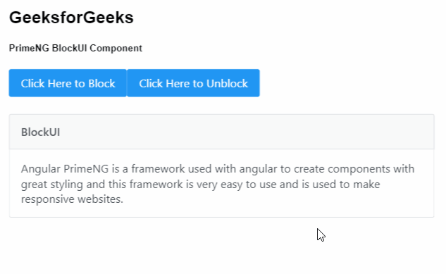
输出:

示例 2:在本示例中,我们将了解如何在消息组件中阻止面板。
app.component.html
GeeksforGeeks
PrimeNG BlockUI Component


    Angular PrimeNG is a framework used with
    angular to create components with
    great styling and this framework is very
    easy to use and is used to make
    responsive websites.
app.component.ts
import { Component } from "@angular/core";

@Component({
  selector: "app-root",
  templateUrl: "./app.component.html",
})
export class AppComponent {
  gfg: boolean = false;
}
app.module.ts
import { NgModule } from "@angular/core";
import { BrowserModule } from "@angular/platform-browser";
import { FormsModule } from "@angular/forms";
import { BrowserAnimationsModule }
    from "@angular/platform-browser/animations";

import { AppComponent } from "./app.component";
import { ButtonModule } from "primeng/button";
import { BlockUIModule } from "primeng/blockui";
import { PanelModule } from "primeng/panel";

@NgModule({
  imports: [
    BrowserModule,
    BrowserAnimationsModule,
    BlockUIModule,
    ButtonModule,
    PanelModule,
    FormsModule,
  ],
  declarations: [AppComponent],
  bootstrap: [AppComponent],
})
export class AppModule {}
输出:
参考: https://primefaces.org/primeng/showcase/#/blockui